Web Design Principles That Drive Business Results

Web Design Principles
That Drive Business Results
good visual work is often invisible — users simply feel that a site works, that it's trustworthy, that the next step is obvious. Bad design is always visible: confusion, hesitation, and exits. At AWDS, the principles that separate high-performing sites from forgettable ones stay consistent across every project we take on.
Core Design Principles Every Business Website Needs
These aren't aesthetic preferences — they're functional decisions that directly impact how users behave on your site and whether they convert.
Visual Hierarchy
Users scan pages in predictable patterns — F-shape for text-heavy content, Z-shape for visual pages. Hierarchy uses size, weight, colour, and placement to guide the eye through content in the order you intend: most important first, secondary second, supporting detail last.
Whitespace
Whitespace isn't empty space — it's breathing room that makes content legible and layouts feel premium. Cramped designs overwhelm users. Generous spacing creates focus, makes each element feel deliberate, and increases the perceived value of your brand.
Typography
Choose 2 typefaces maximum — one for headings, one for body. Size hierarchy matters: a clear distinction between h1, h2, h3, and body copy guides readers through structure. Line height, letter spacing, and measure (line length) all affect readability at a subconscious level.
Colour Strategy
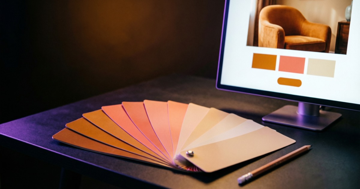
Colour communicates before words do. A primary brand colour, a neutral palette for backgrounds and text, and a single accent colour for CTAs — this is all you need. More colours create visual noise. The accent colour should draw the eye directly to your most important action.
Consistency
Consistent buttons, spacing, heading styles, and card layouts build a visual language. When users learn how your site works on page one, they navigate confidently on page ten. Inconsistency creates cognitive load — users spend energy figuring out the interface instead of engaging with your content.
Accessibility
Accessible design isn't charity — it's good business. Sufficient colour contrast, keyboard navigation, alt text for images, and legible font sizes benefit everyone, including users on poor connections, bright sunlight, or ageing devices. In many markets it's also a legal requirement.
Design Trends Shaping 2025–2026
Trends are tools, not mandates. Use them when they serve your users — ignore them when they don't. These three are delivering measurable UX improvements right now.
Dark Mode by Default
Over 80% of smartphone users use dark mode when available. A properly implemented dark theme reduces eye strain, saves battery on OLED screens, and makes your brand look sophisticated and modern. Done well — with purpose-built themes rather than simple colour inversions — it's a seamless experience.
Micro-Interactions
Small, purposeful animations that acknowledge user actions: a button that subtly scales on hover, a form field that smoothly highlights on focus, a card that lifts slightly when you hover. These micro-interactions make interfaces feel responsive and alive — confirming that the system is working with the user.
Structured Minimalism
Not minimal as in empty, but minimal as in intentional. Every element earns its place. Rich content is structured into clear sections with generous padding, bold typographic anchors, and card-based layouts that make complex information scannable. Complexity handled with clarity.
How We Approach Every Design Project
good visual work doesn't start with a blank canvas — it starts with understanding. Our process ensures that every visual decision serves a business objective.
Discovery: Understanding Your Users and Goals
Before any pixels, we map your target audience: who they are, how they navigate, what they're looking for, and what builds their trust. We audit competitor designs — not to copy, but to find gaps. We define the business goals the design must serve: leads, sales, sign-ups, phone calls.
Structure: Wireframes and Information Architecture
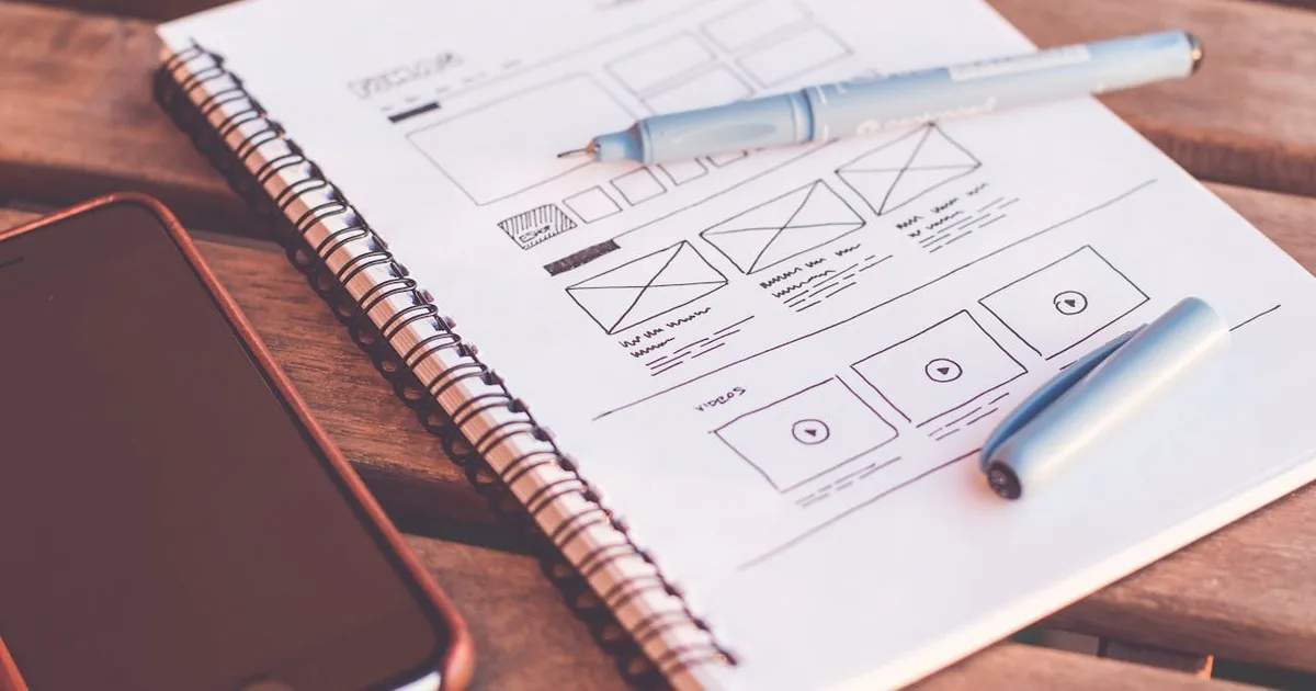
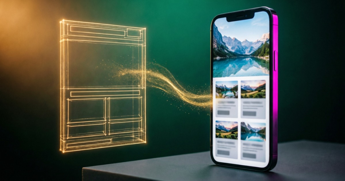
We sketch the structure before applying any visual design. Wireframes define what goes where, in what order, at what size. Information architecture decisions — navigation structure, content hierarchy, CTA placement — are made at this stage, not after the design looks polished. Structure first, aesthetics second.
Design: Visual Language and Component System
We build a UI system — colour palette, type scale, spacing system, component library — before designing individual pages. This ensures consistency across every page without manual repetition. Dark mode variants are designed in parallel, not retrofitted. Every component is responsive from day one.
Validation: Testing Against Real User Behaviour
No design ships without validation. We test with heatmaps, session recordings, and user feedback. We verify performance — a beautiful design that loads in 6 seconds is a failed design. We cross-test light mode, dark mode, mobile, tablet, and desktop. Only when the design performs does it ship.
Key Takeaway
Web design is not art — it's engineering with aesthetic intent. Every decision, from typeface to padding to button colour, either helps or hurts your business goals. The six core principles — hierarchy, whitespace, typography, colour, consistency, and accessibility — are not a checklist but a system. When they work together, the design disappears and the user experience takes over. That's when layout does its job: making the right action feel obvious and the right brand feel trustworthy. Start with principles. Add the right trends. Build with a system. Ship with data.
Related Articles
Maximizing Conversions: Landing Pages
How professional landing page visual drives measurable business results
Fine-Tuning Your Website's Aesthetic
Practical tips for polishing your visual layout to the next level
SEO Insights: Optimizing for Google
How visual choices affect SEO — from lightning-fast loading to structured data
Ready to Redesign Your Website?
Tell us about your business — we'll assess your current layout, identify conversion gaps, and propose a roadmap to a site that performs.
Get a Visual Audit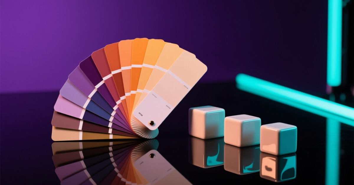





Comments (0)
No comments yet. Be the first!