A legal brand: trust through design
Afina is a project that combines a corporate website and a full branding package for a law firm. Every element — from the business card to the outdoor sign — communicates professionalism and reliability.
Corporate website
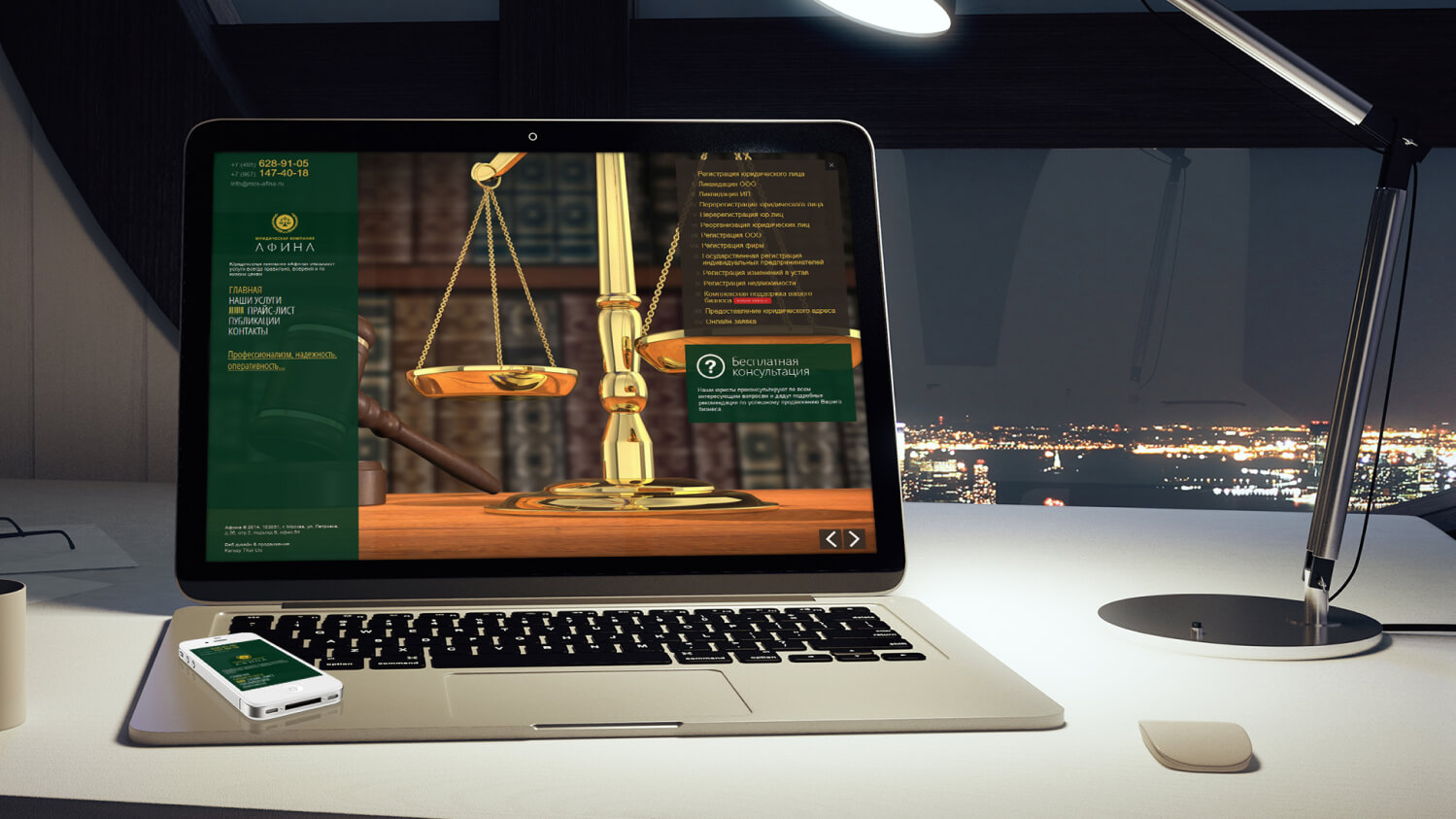
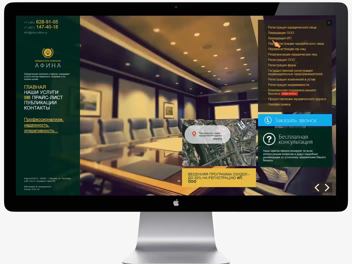
A concise design with the ability to hide secondary content. Clean typography, a strict grid and minimal decoration all create a sense of order and control. Navigation is hierarchical: from general information to specialized sections on practice areas and consultations.
Branding
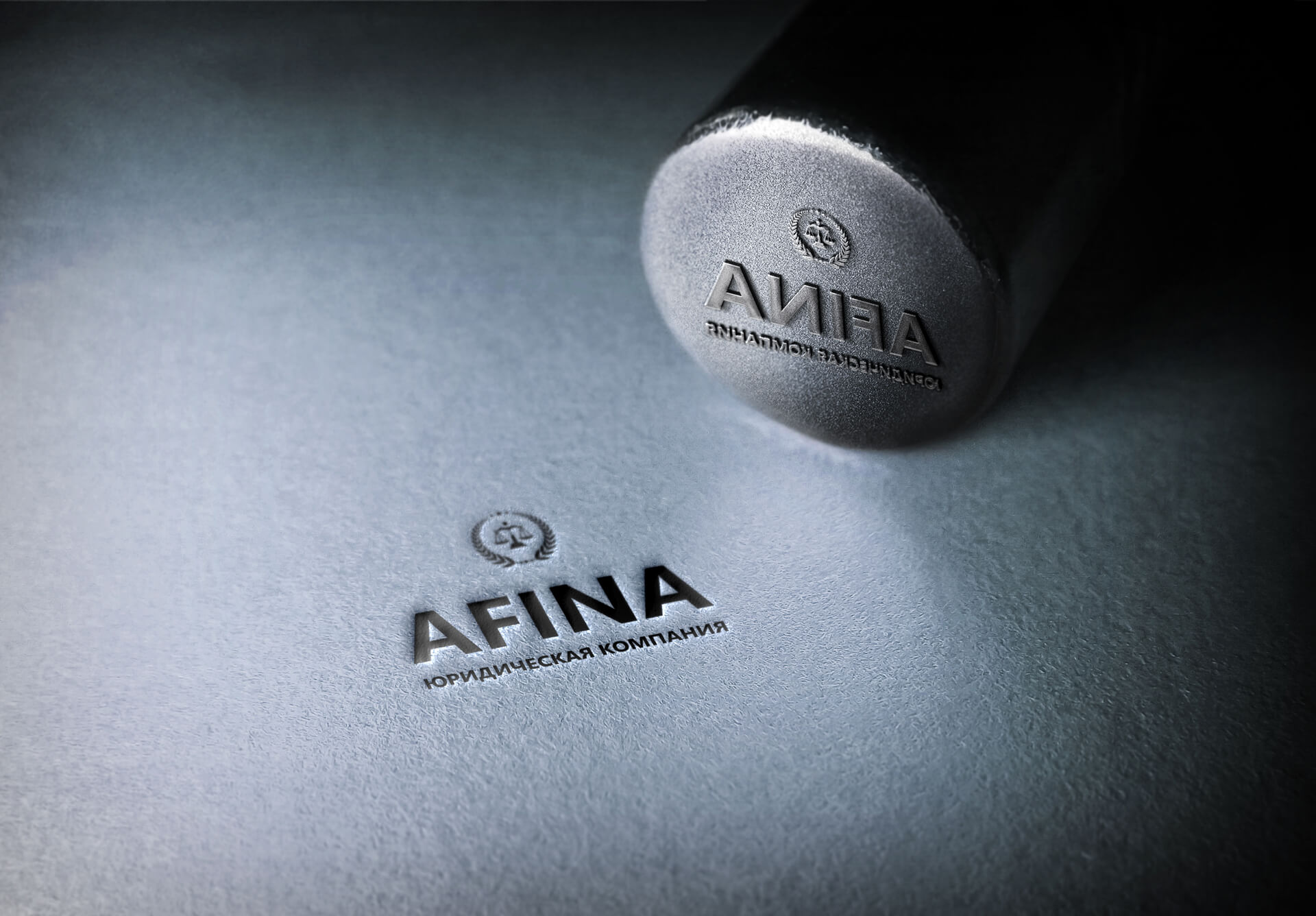
A brand book with a crumpled-paper effect — an unconventional approach for the legal field that evokes documents and paperwork. The official company seal is an element that underlines the firm’s official status. Every brand carrier — from letterheads to envelopes — follows a single style.
Outdoor advertising
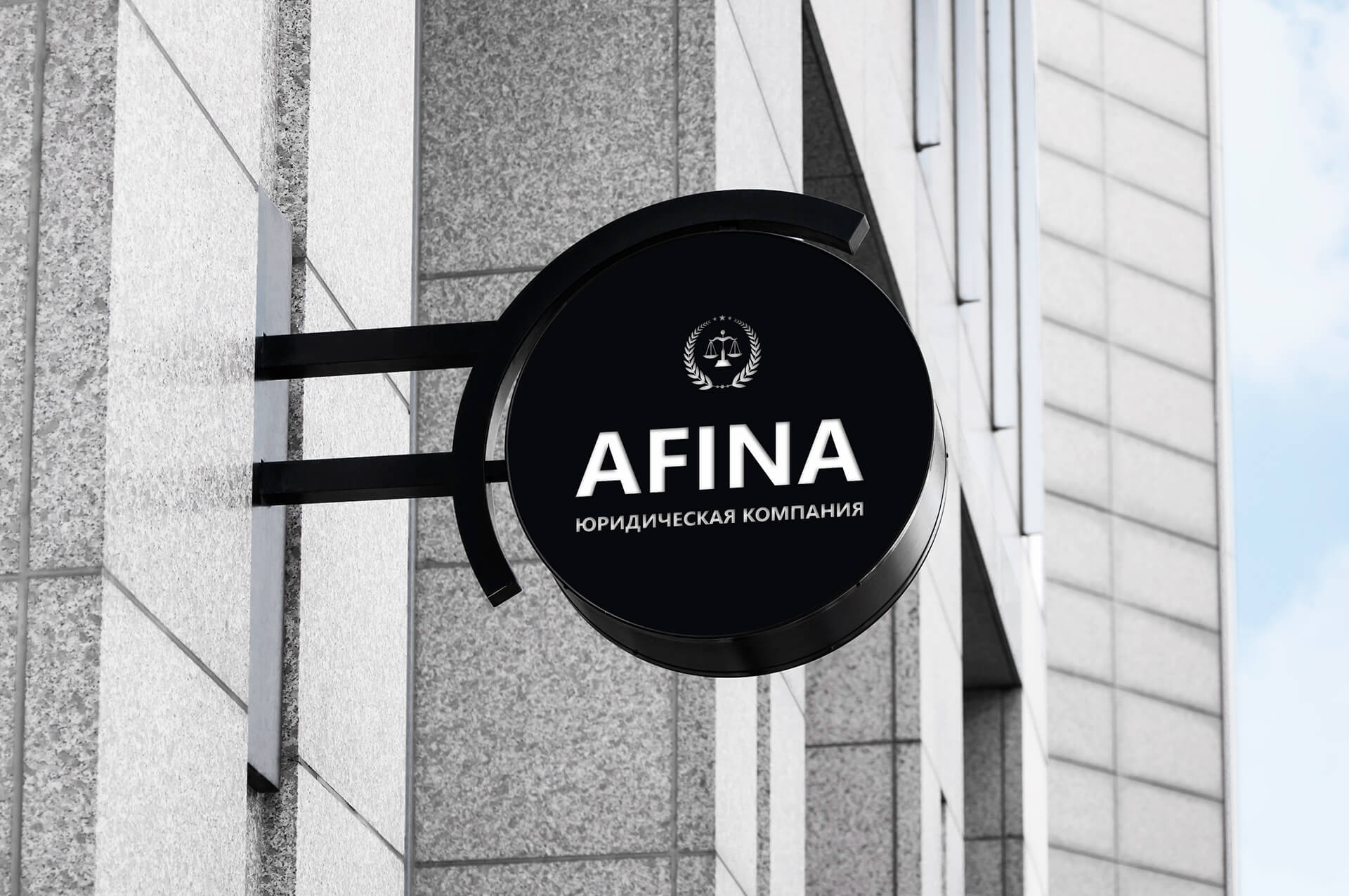
A sign with neon backlighting at night is the key element of the street identity. The neon glow keeps it visible after dark and evokes a sense of prestige. The sign structure was designed around the architectural features of the building so that it blends naturally into the facade. Materials were chosen for durability: resistance to temperature swings, precipitation and ultraviolet radiation. The color of the neon glow precisely matches the brand palette.
Project card
- Client
- Afina
- Year
- 2013
- Website
- mos-afina.ru
- Industry
- Legal services
- Expertise
- Corporate website, Design, Brand book, Logo, Development
- Highlight
- Crumpled-paper effect, neon sign
Sign, seal and brand identity
An outdoor sign with neon backlighting and print materials — the visual embodiment of a legal brand.
Key project solutions
An integrated approach to building a law firm’s corporate presence: from the website to outdoor advertising.
Content structure
Legal content requires a special approach to structure. We developed a system for hiding secondary information: the core services are visible right away, and details open on demand. This lets visitors find their way quickly and reach the section they need without information overload on the first screen.
A brand book with character
The crumpled-paper effect in the brand book is a deliberate choice for a law firm. Crumpled paper is associated with real work, with documents that are actually used. The technique creates a tactile sense of authenticity and sets the brand apart from competitors’ sterile corporate designs.
Neon sign
The outdoor sign with neon backlighting at night was designed around the building’s architecture. The neon glow keeps it visible and eye-catching at any time of day. The structure is made of durable materials, and the color of the glow matches the palette of the firm’s legal brand.
Mobile adaptation
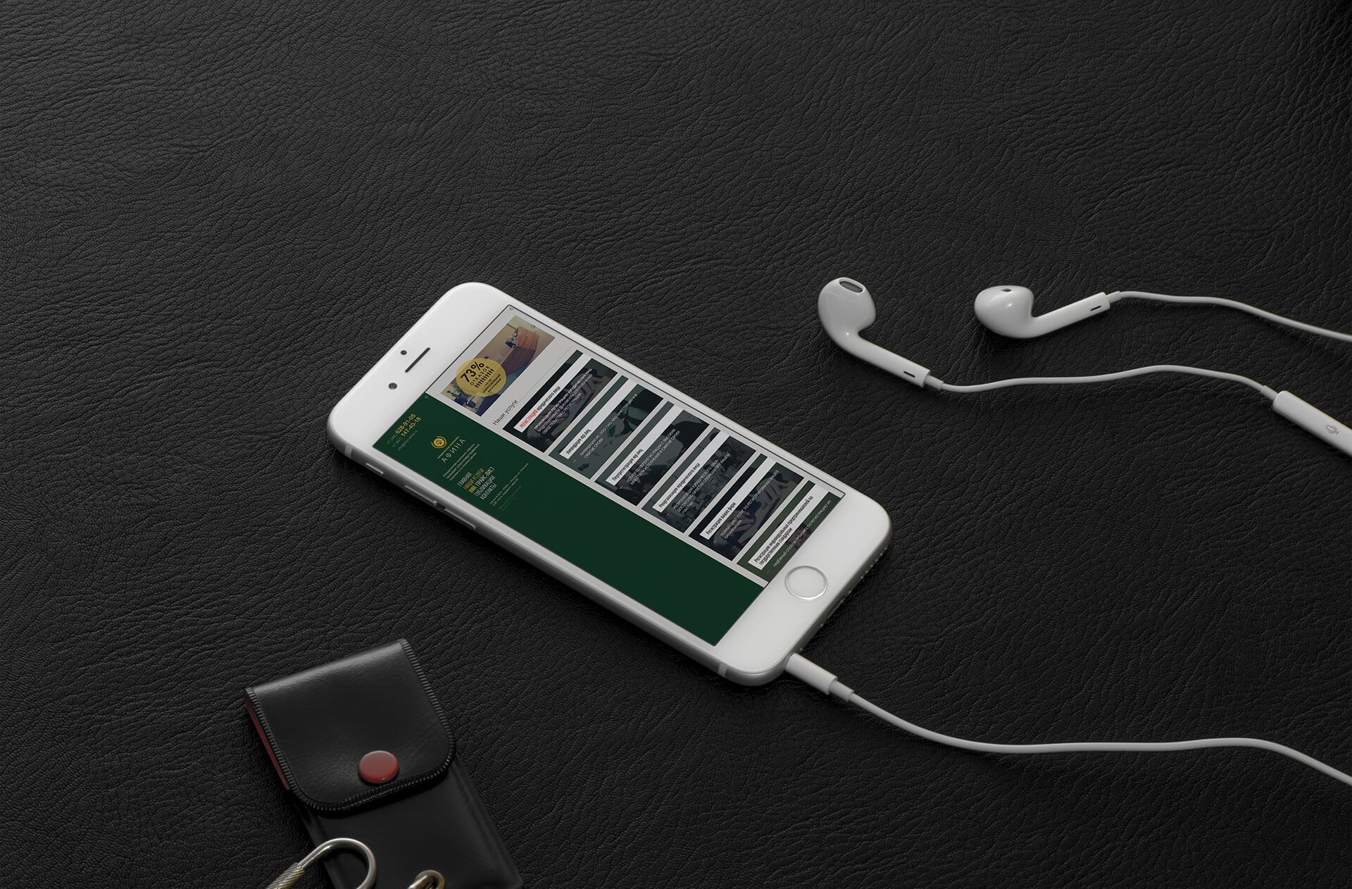
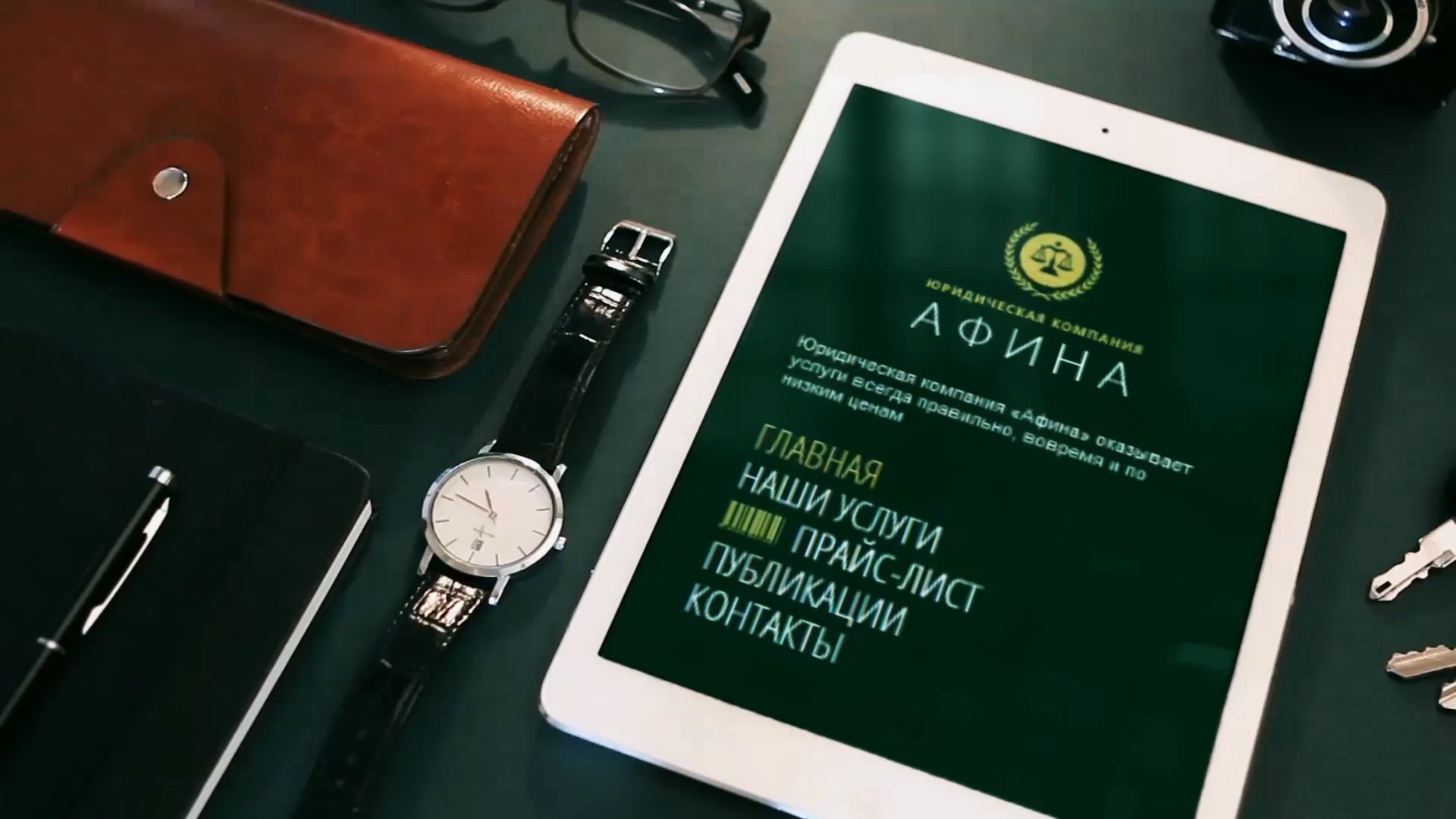
A responsive version of the website with a focus on the mobile menu. People often search for legal services on their smartphones, so mobile navigation is a priority: a convenient menu, large contact buttons, quick access to the phone number and the feedback form. The concise design holds up at every screen resolution.
Official seal
The company’s official seal is not just a formality but a brand element. The seal is designed in a style consistent with the rest of the identity. Security features make it unique and hard to forge. The seal is used on all of the company’s official documents.
Business stationery
A complete set of business stationery: business cards, letterheads, envelopes and document folders. Every item follows a single style using the brand colors and typography. The quality of printing and materials underlines the status of a law firm.
Stages of building a legal brand
A systematic approach to building the brand of a law firm: from market analysis to producing outdoor advertising.
Analysis and positioning
Research into the legal services market and the industry’s visual standards. Defining the target audience: private clients and corporate customers. Articulating the brand’s core values: reliability, professionalism and confidentiality. Choosing an unconventional visual technique — the crumpled-paper effect — to stand out from competitors.
Design and brand book
Developing the logo, color palette and typography. Creating a brand book with usage rules for every medium. Designing a corporate website with responsive navigation and a mechanism for hiding secondary content. Designing the official seal and a set of business stationery.
Implementation and launch
Developing the corporate website with a responsive mobile version. Producing print materials: business cards, letterheads, envelopes and folders. Manufacturing and installing the outdoor sign with a neon glow at night. Checking every element against the brand book. Handing the guidelines over to the client’s team.
AFINA
Additional pages

AFINA
Video
The right solutions for your business
Ready-made packages for building a corporate presence and brand.
Frequently Asked Questions
Honest answers about how we work, what it costs, and what you can expect