A platform for the premium construction segment
TM Estate is a project that combined a digital platform with a complete branding package for a premium construction company. The target audience is affluent clients who care about every visual detail.
Visual concept
The color scheme is inspired by the aesthetics of the 1850s. Dark green, crimson (#75151e), white and gold convey respectability and stability. Every element — from buttons to icons — is built around this palette, making the brand instantly recognizable in any medium. The palette was tested across devices and materials: monitors, CMYK print and outdoor advertising. Color calibration ensures identical perception in every environment.
Project scale
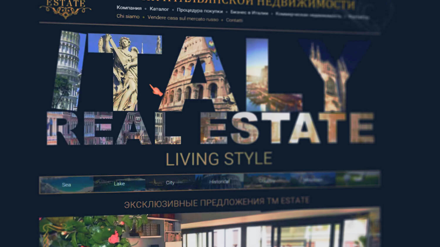
The TM Estate ecosystem spans more than thirty interconnected services and websites. Each follows a single design standard, keeping the brand perception consistent. More than ten thousand banners were created for a range of advertising platforms, covering all key formats and sizes.
Print materials
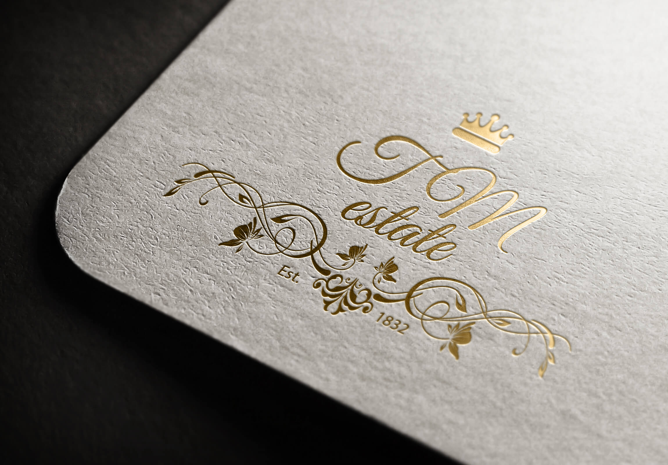
A complete set of print materials: business cards, letterheads, envelopes and brochures. All materials share one color system and typography, which keeps the brand recognizable in offline communication. Special attention was paid to the tactile feel of the materials.
Project card
- Client
- TM Estate
- Year
- 2014
- Website
- tmestate.com
- Industry
- Construction / Premium segment
- Expertise
- Promo website, Animation, 3D, Brand book, Video
- Palette
- Dark green, Crimson, White, Gold
Corporate identity and brand media
Business cards, the color palette, adaptation to devices — every element is thought through to the smallest detail and matches the style of a premium construction brand.

Key project solutions
A comprehensive approach to building a digital ecosystem and branding for a premium construction company. Every decision was aimed at strengthening the brand’s positioning.
Promo website
A multi-page online platform with animated sections, parallax effects and a responsive layout. Every page reflects the client’s status: large images, refined typography and a noble palette. Navigation is structured so that visitors get to know the company’s services step by step.
Brand book and styling
A complete brand book defining the rules for using the logo, typography, colors and graphic elements. The styling is inspired by the aesthetics of the 1850s — crimson (#75151e) as the main accent color, with dark green and gold combined to add depth and nobility to the visuals.
3D and animation
3D visualization of architectural projects and interiors. Animated transitions between site sections create a sense of premium quality. Videos with 3D elements present the key construction projects, showing the scale and detail of the company’s work.
Print materials
Business cards, brochures, letterheads, envelopes — the full range of business print. Every printed piece is carefully calibrated for color, fonts and proportions. Specialty papers and finishes (embossing, varnishing) enhance the tactile impression.
Responsive design
The platform displays correctly on every device, from widescreen monitors to smartphones. Responsive navigation stays easy to use on mobile screens. Special attention was paid to load speed on mobile devices so users don’t lose interest in the content.
Banner system
More than ten thousand banners in various formats for advertising platforms and partner networks. An automated template-based banner generation system made it possible to scale graphic content production while keeping a consistent style across all placement formats.
Stages of building the TM Estate ecosystem
From the first meeting to the launch of thirty services, every stage was documented and agreed with the client’s team.
Research and strategy
An in-depth analysis of the premium construction market. Competitor research, defining the target audience and shaping the brand positioning. Developing the visual strategy: choosing the 1850s palette, typography and stylistic devices. Creating a mood board and agreeing on the direction with the client.
Design and prototyping
Prototyping key pages and brand media. Testing the palette on different devices and materials. Developing animation concepts for the promo website. Parallel work on 3D visualization of construction projects. Review rounds with the client’s architects and designers.
Implementation and scaling
Phased development of thirty services and websites. Producing 10,000 banners through a template system. Preparing print materials, from layouts to print runs. Final assembly of the brand book with rules for using every visual element of the ecosystem, for internal and external contractors.
Related services
Corporate website development, branding and design for business.
Frequently Asked Questions
Honest answers about how we work, what it costs, and what you can expect