Shoppers narrow down the catalog — the page never flashes or jumps to the top
In a typical catalog every click on a filter or sort option loads a new page: a white screen, the scroll position is lost, and the shopper has to find their place again. By the third filter many give up.
Here the product list changes in place: pick a category, sort by price, load more — all without a reload, and the selection is kept in the page address.

For catalogs longer than one screen
Stores with dozens or hundreds of products, service catalogs, price lists with price and category filters — wherever a shopper narrows the choice several times in a row.
Store owner
Shoppers stay in the catalog: they narrow the choice with clicks and never lose their place.
Marketer
A filtered, sorted selection is a plain link. Put it in a newsletter or an ad — exactly that selection opens.
Shopper
Filter, sort, more products — the list changes at once, with no white screen and no jump to the top.
Pick a category — the list changes in place
A click on a filter option replaces only the product list and the panel itself: the chosen option shows at the top next to “Clear All”. The header and the menu stay put; if the list has scrolled above the screen, the page glides back to its start, and the selection appears in the page address.
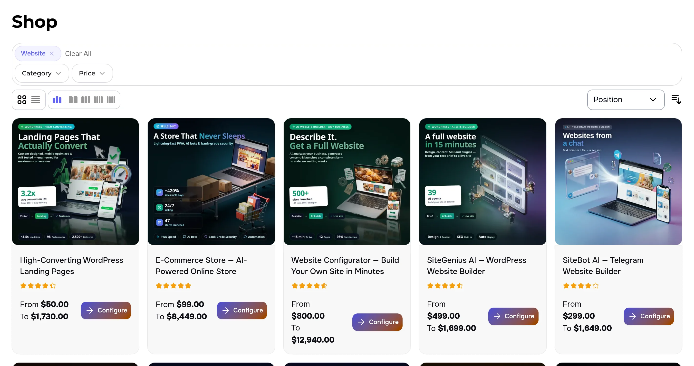
More products — right under the last card
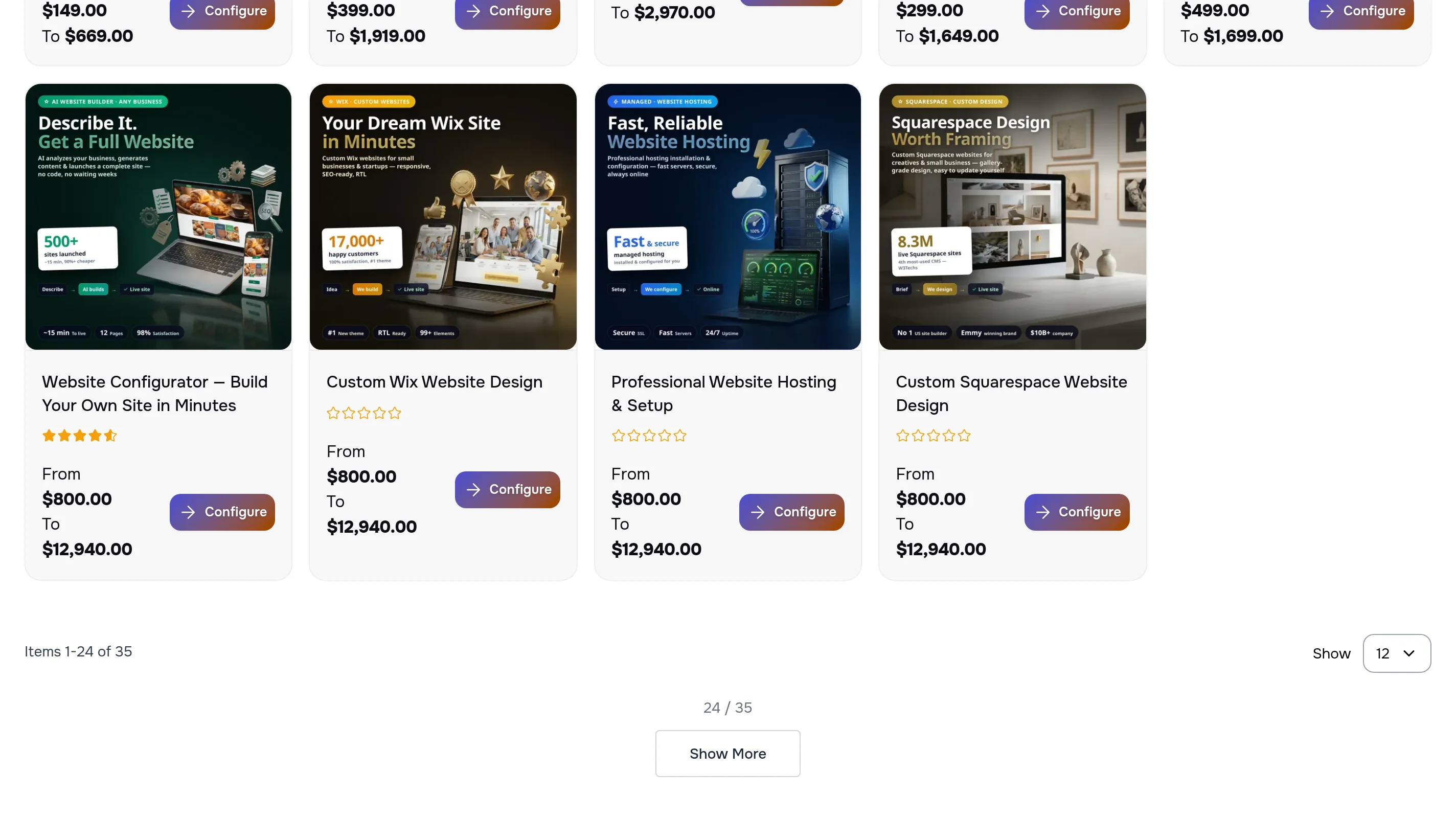
Instead of jumping between pages 1, 2, 3 there is a Show More button right under the list. New cards join the end, and the counter shows how many are on screen and how many there are in total. The sorting and the filter stay in place.
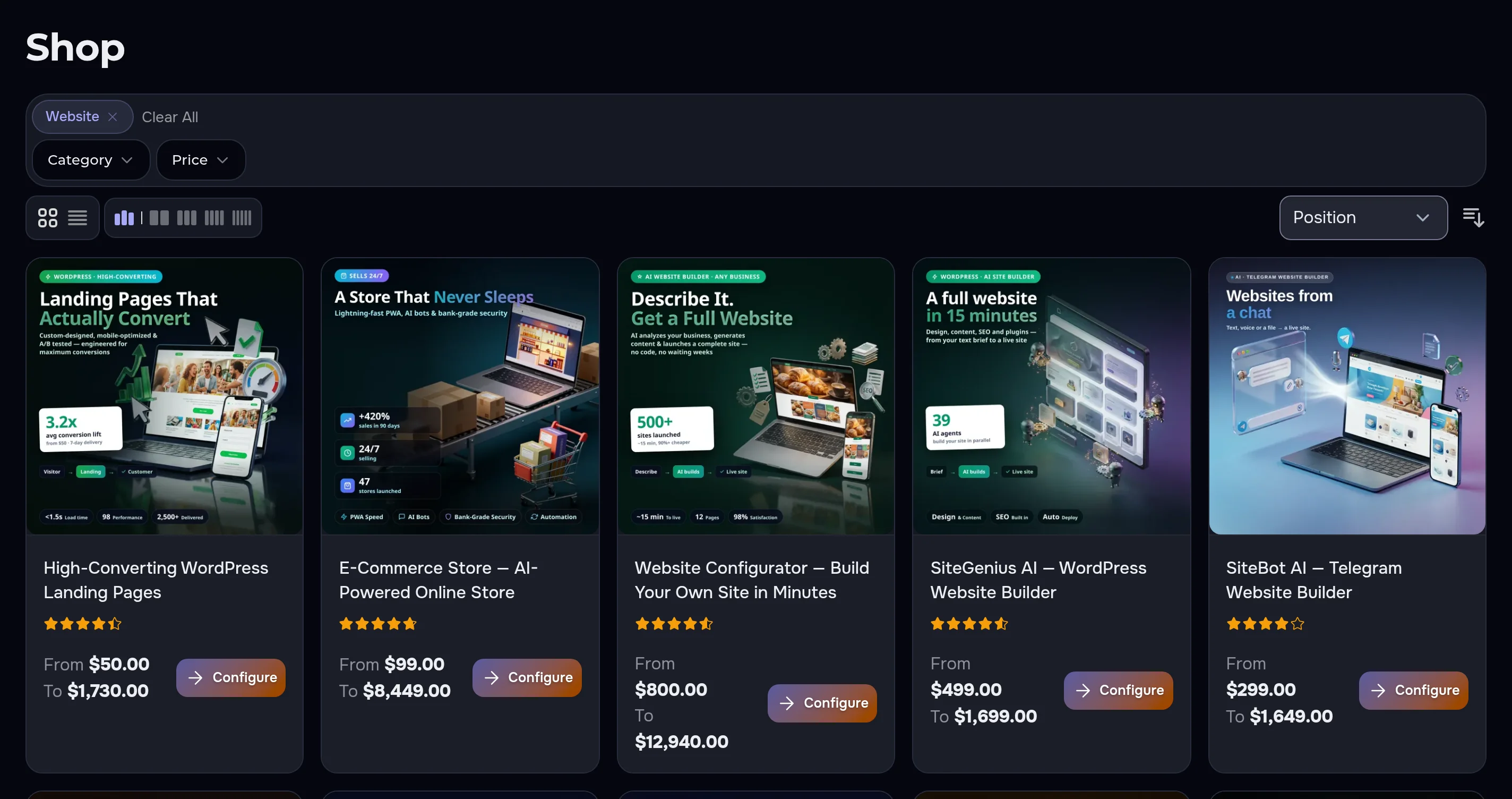
Just as neat in the dark theme
The filter panel, the chosen option and the cards take the site theme colors — in the dark theme everything reads as clearly as in the light one.
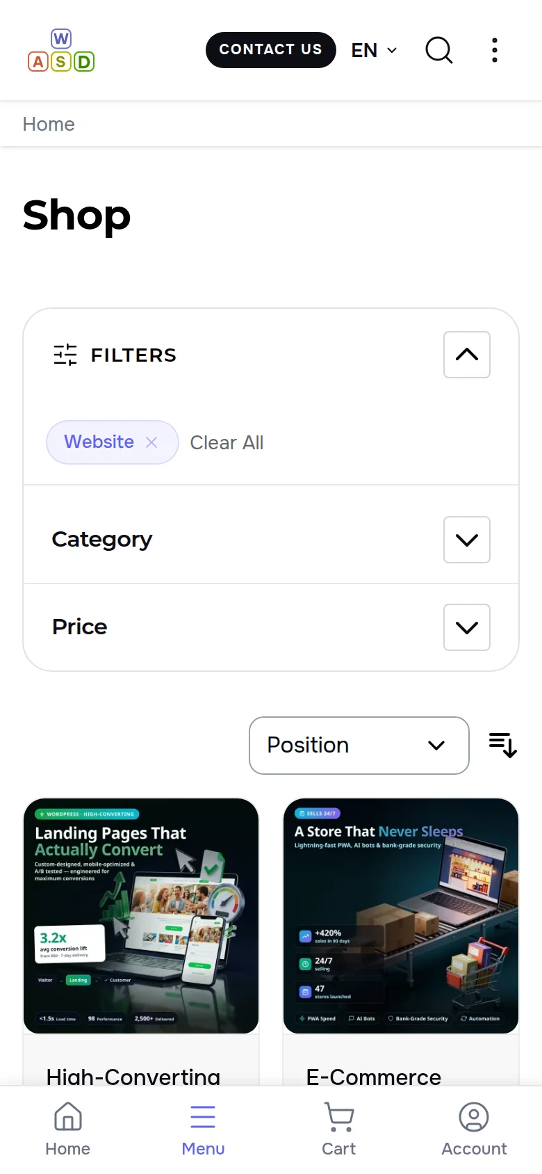
On a phone the filter panel does not close after every choice
On a narrow screen the filters live in one panel. After an option is picked the list behind it is already new, and the panel stays open — the next filter is one tap away.
- Filters panel — opens with one button and does not collapse after a choice
- Chosen options on top — each one is removed with a cross, all at once with “Clear All”
- Sorting next to it — by position, name or price — also without a reload
Convenience with no risk to orders or search
- The address remembers — filter, sorting and the loaded page live in the link; the browser Back and Forward buttons return earlier selections
- A failure does not block a purchase — if a request fails, the site simply opens the same selection with a regular page load — the shopper keeps their choice
- Search engines see the catalog as before — catalog pages stay regular pages with their own addresses and page links
- Nothing to configure — works in every catalog category at once, with the filters the site already has
We went through the catalog as a shopper — step by step
- In the English and the Russian version, in the light and the dark theme, we picked a category, sorted by price, pressed Show More and went Back — the page did not reload once.
- Show More added 12 cards to 12 — the counter read “24 / 35”, and the button sits right under the last card.
- On a phone the Filters panel stayed open after a category was chosen, and the list behind it updated.
A catalog that is easy to choose from
We will set up your store catalog: filters, sorting and loading more products without reloads — on desktop and phone, in the light and the dark theme. Launching a store from scratch? See our online store development service.