A menu where visitors find what they need at a glance
Once a site has dozens of services and hundreds of pages, a plain drop-down turns into a wall of links. Here every menu item has its own panel: a section showcase with descriptions, a grid with icons or a compact list. Visitors see the whole structure at once and land on the right page the first time.
Below are real screens from our own website: the services, shop and “About” menus, the dark theme, the phone view and the admin panel.
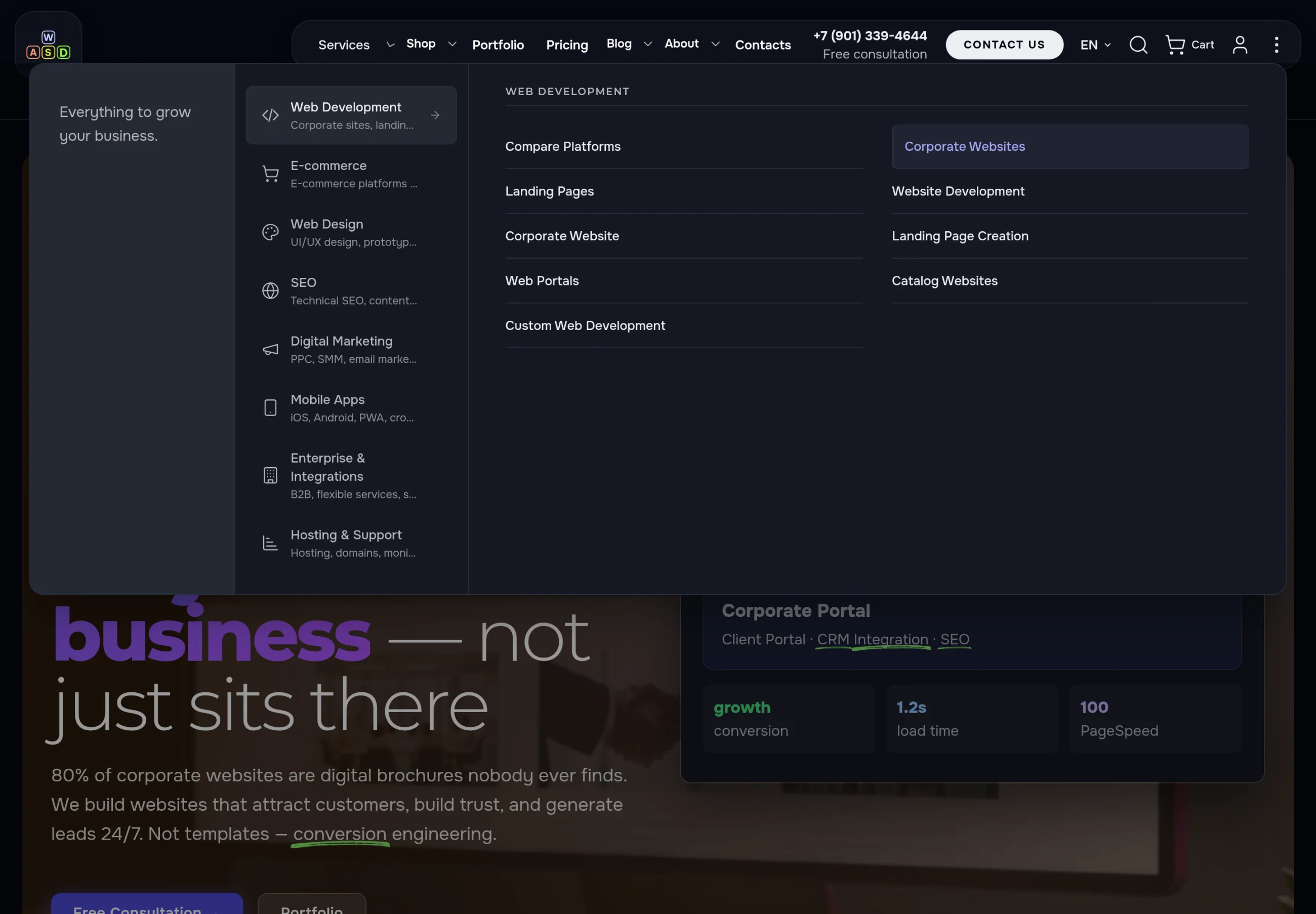
If you have more pages than fit into a menu bar
Agencies and service companies with dozens of services, shops with a wide catalogue, sites with a big blog and help sections — anywhere visitors leave because they could not find the right page.
Many services
Services are grouped into sections with a short description — visitors pick a direction first, then the exact service.
A wide catalogue
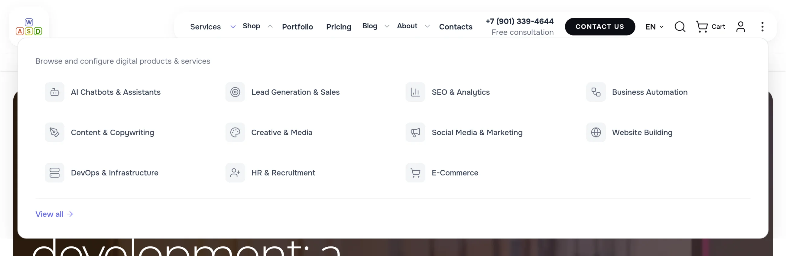
Shop categories as tiles with icons: clear without reading, easy to hit with the mouse.
Many info pages
About, guarantees, shipping, returns — in a compact panel with a short intro, not a dozen items in the header.
The direction on the left, all its pages on the right
The Services panel spans the full screen width. On the left: sections with icons and a short caption; on the right: the section’s links in two columns. Hover “SEO” and its services are already on the right — no reload, no extra clicks.
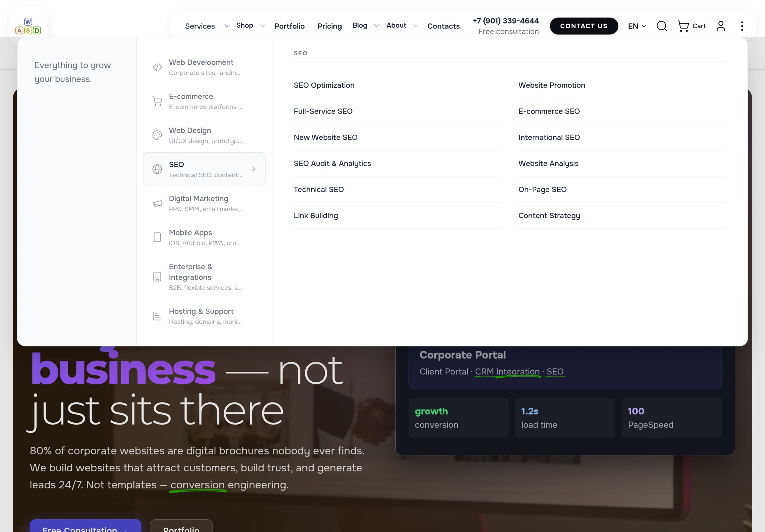
What visitors see
- Every direction at once — no guessing where to look.
- A caption under each section: what is inside.
- The section’s links on the right, large and well spaced — easy to hit with the mouse.
- Open another menu item and the previous panel closes by itself; a click outside the panel closes it too.
A catalogue that makes sense without reading
Shop categories are shown as tiles: an icon and a name. The eye catches the icon first — a chat bot, a target, a chart, a cart — so the right category is found faster than in a list. A link to the full catalogue sits at the bottom.
A short section gets a small window with an intro
A section of a few pages does not need a full-screen panel. A small window opens under the item: one sentence about the section and a “View all” link on the left, the section’s pages on the right.
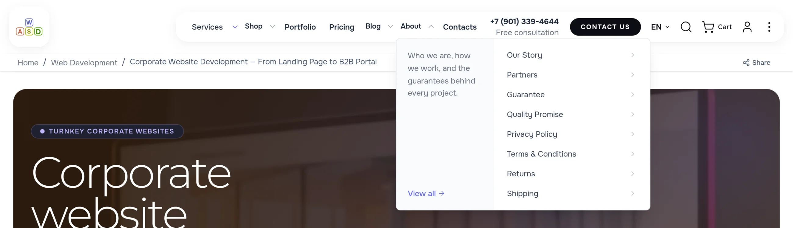
Every item gets its own style
- Showcase. for the main section with directions and captions
- Grid. for categories recognised by their icon
- Columns. for a long list split into groups
- Compact panel. for a section of a few pages; an item can also have no panel at all
On a phone — a menu with icons, open where you are
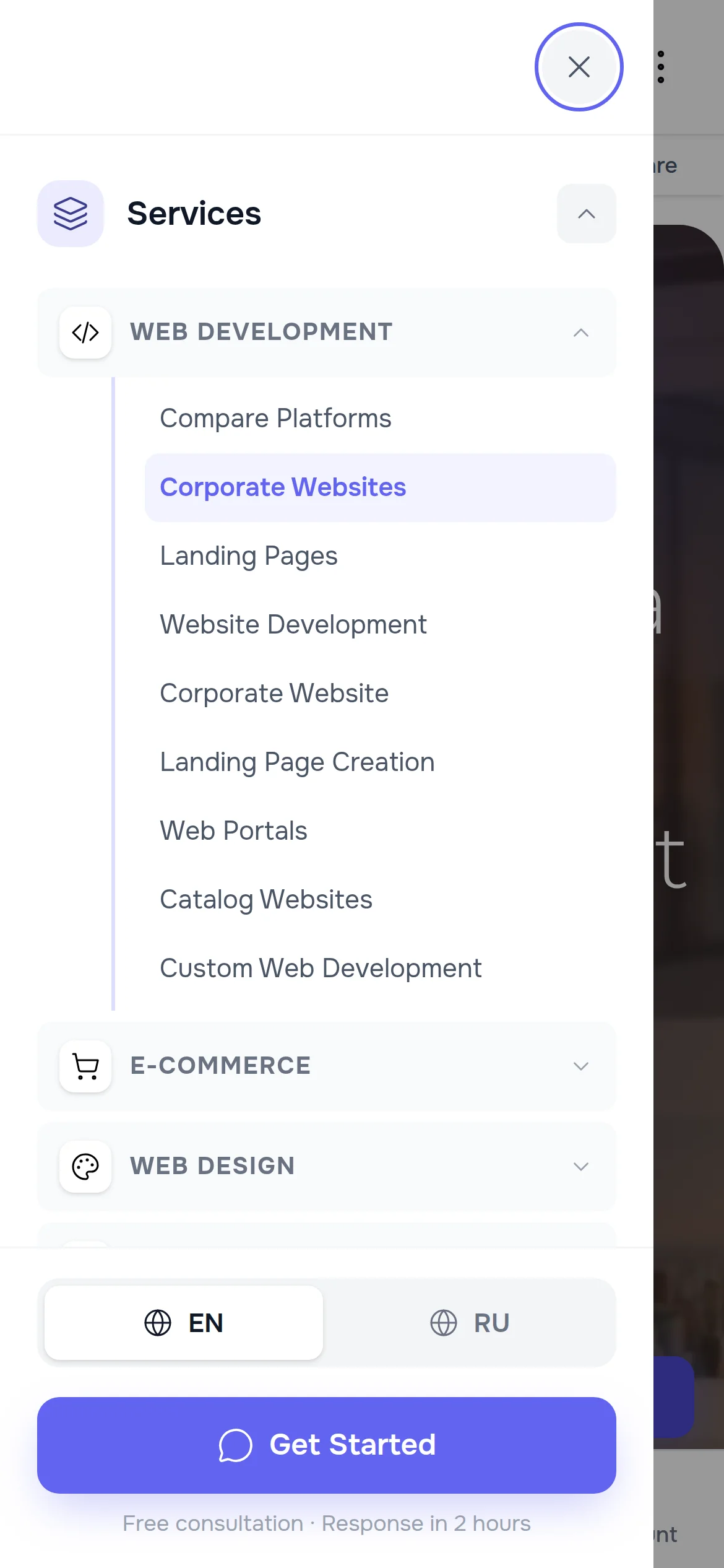
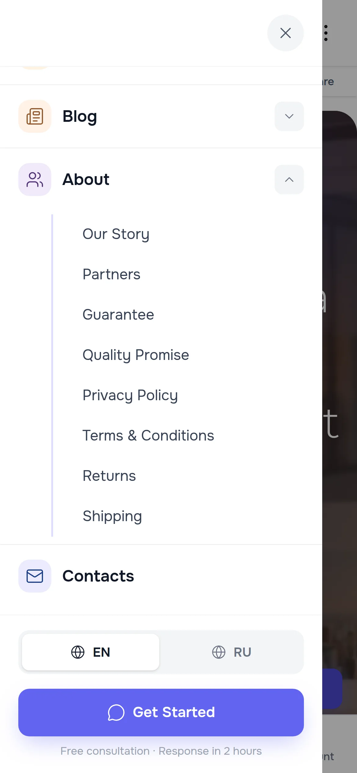
On a phone the menu slides in full screen: large items with icons, sections that open on tap. The menu opens the current page’s section by itself and highlights the page — visitors see where they are and reach the next service with one tap. The language switch and a contact button sit at the bottom.
Items, sections and icons live in the admin panel, no developer needed
Every menu item is edited in the admin panel: name, address, order, panel style, the description for the side column, an icon from the gallery and its colour. Each language version of the site has its own items. Sections and links are put together in an editor: a page is picked from the list of site pages.

Colours come from the site palette
- Icon and background colours are picked from the theme palette — primary, accent, success, warning and more.
- In the dark theme the icons turn lighter by themselves — readable on a dark background with no extra setup.
- Change the brand colour in the theme settings and the menu icons follow.
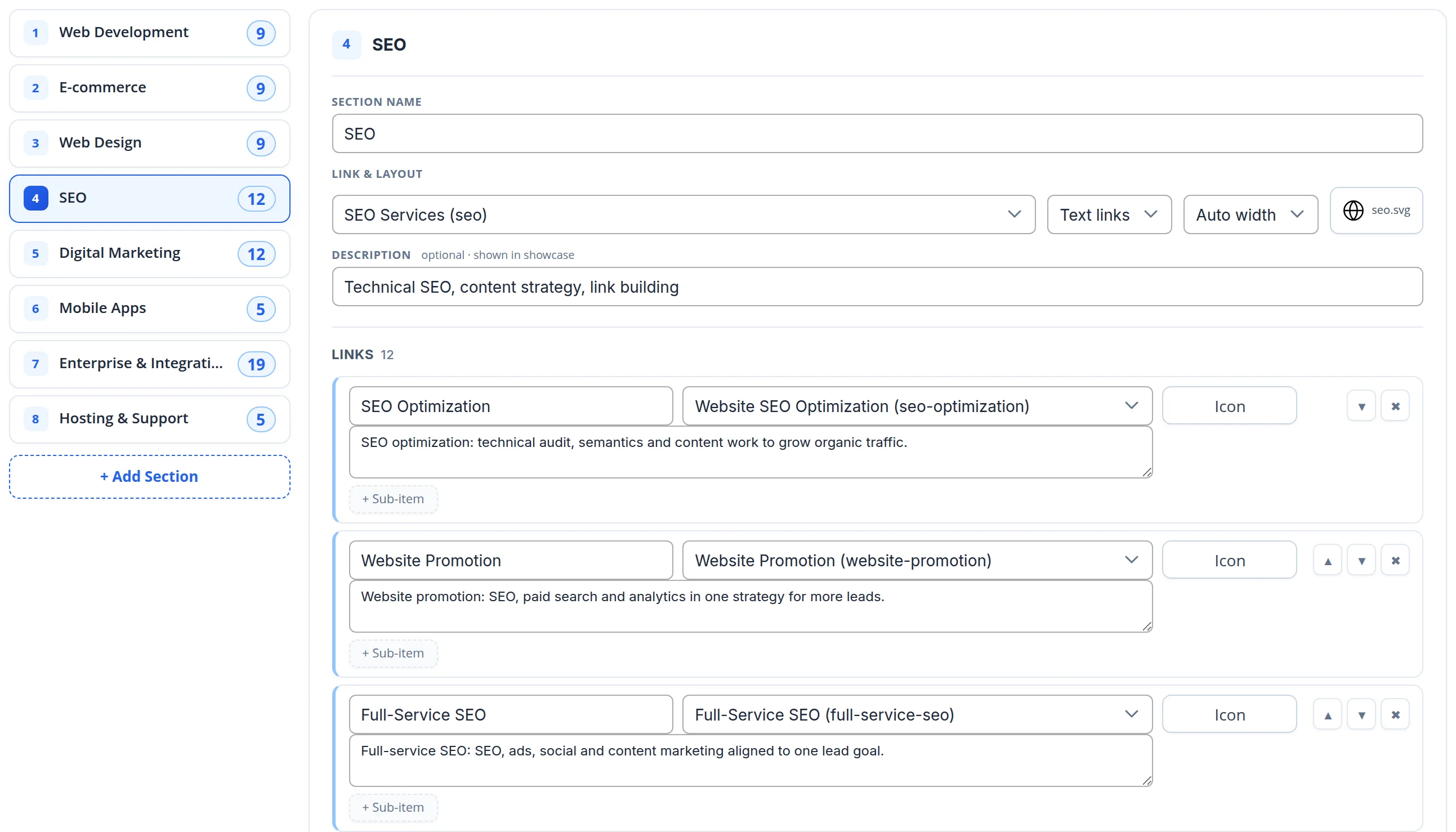
Sections and links in one editor
- On the left — every section of the item with its number of links; reorder with the arrows, add a new section with one button.
- Each section has its own name, page, link style, column width, icon and a short description for the showcase view.
- Links are not typed by hand: the page is picked from the list of site pages, with a note and an icon next to it; a link can get its own sub-item.
The menu helps both visitors and search engines
Links search engines can see
Every menu link is a regular link in the page code, not something loaded on click. Search engines find every section of the site from any page.
Site structure in the markup
The list of menu items and their addresses is also given to search engines as separate markup — it helps them see which sections matter most.
Screen-reader friendly
The expand button carries a “Show submenu for …” label and an expanded/collapsed state.
Let’s build the menu for your site
We will sort your pages into sections, pick the right panel style and icons for every item — so visitors reach the right page in one or two steps. Need a whole website? See our development service.
Another case: clients build their own order — and see the price instantly →