Your brand colours and fonts across the whole site — changed in the admin panel, with no developer
A new brand colour usually means a ticket to a developer: find every button, badge and link, check the text still reads, test the dark version, publish. A small change takes a week.
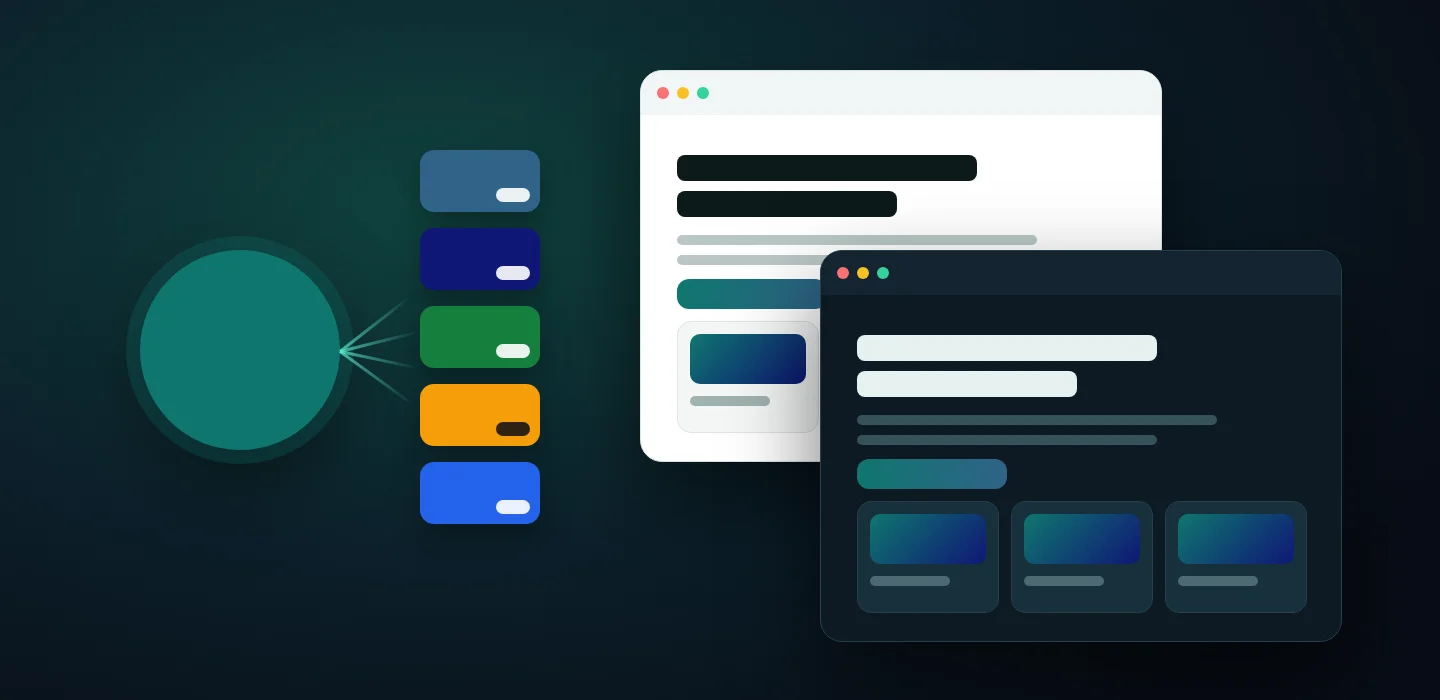
Here the look of the site is a set of settings. Enter one brand colour and the site offers a full palette, checks that every piece of text on it stays readable, and after saving repaints every page on its own — in the light and the dark theme, on a computer and on a phone.
For businesses whose site has to look like their brand, not like a template
Stores, studios and service companies that refresh their brand, run seasonal campaigns or keep several language versions of one site.
Owner
The site matches the brand book, and a new colour or font no longer means a paid task and a week of waiting.
Designer and marketer
Colours, fonts, card and button styles are chosen from options with a preview of each — and the readability check keeps the brand accessible.
Manager
Changes go live after one save. Every language version of the site can have its own colours and fonts.
One brand colour — and the site suggests the rest of the palette
Every colour pair shows a readability score next to it: a green mark means text on that background meets the international readability standard, a red one warns that it does not. On the left are the colours as they are set now: text on the main colour is marked unreadable. On the right, one click after entering a new brand colour: the secondary and accent colours, status colours, borders and text colours are filled in, and all ten pairs pass.
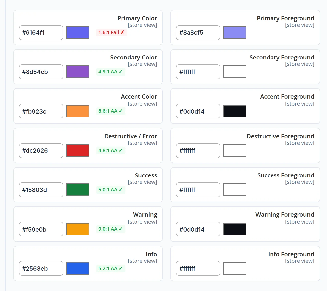
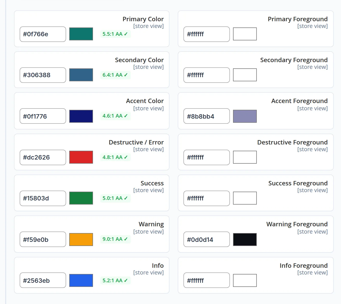
The check works before anything is saved: an unreadable pair is marked red right in the form, so it is caught by the person choosing the colours, not by visitors.
Fonts for headings and text — with separate sizes for a computer and a phone
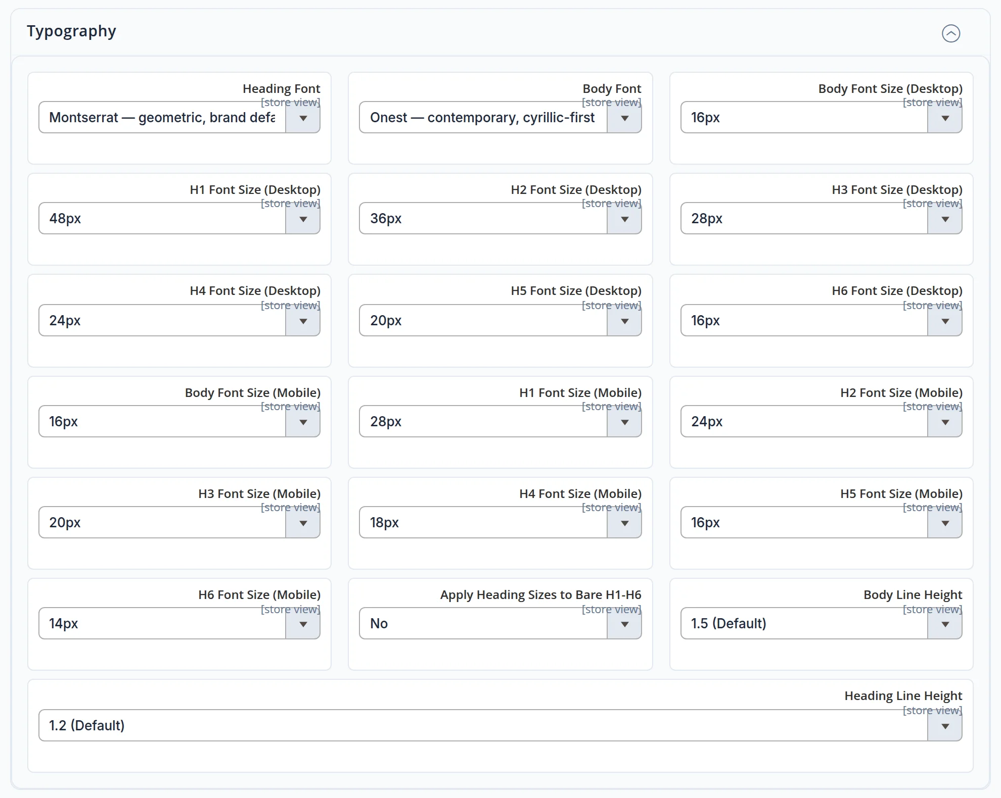
Pick a heading font and a body font and set the size of the text and of every heading level separately for a large screen and for a phone. Seven fonts support both Latin and Cyrillic and are served from the site itself: the Cyrillic part loads only when a page needs it, and while the font loads, the stand-in is sized to match so the text does not shift.
The character of the site — in a few clicks, from options you can see
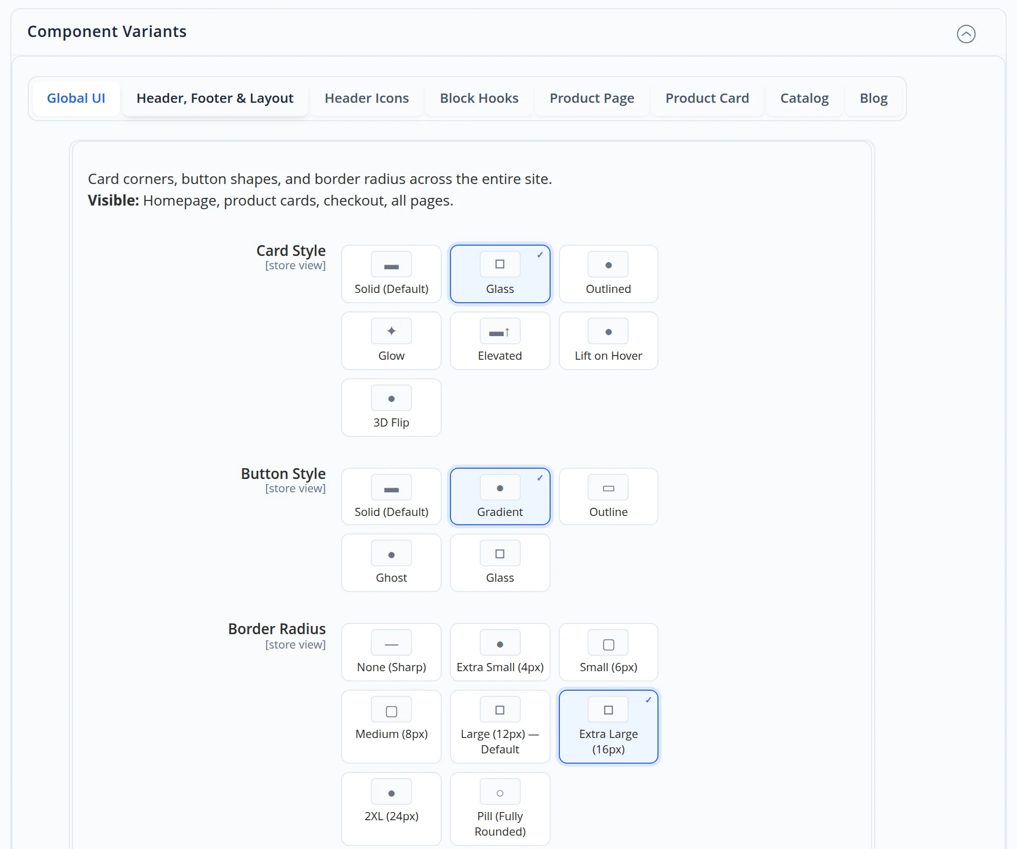
Cards can be solid, glass, outlined, with a glow or a raised shadow; buttons solid, gradient, outlined or glass; corners from sharp to fully rounded. Each option is a tile with a small preview, the current choice is ticked.
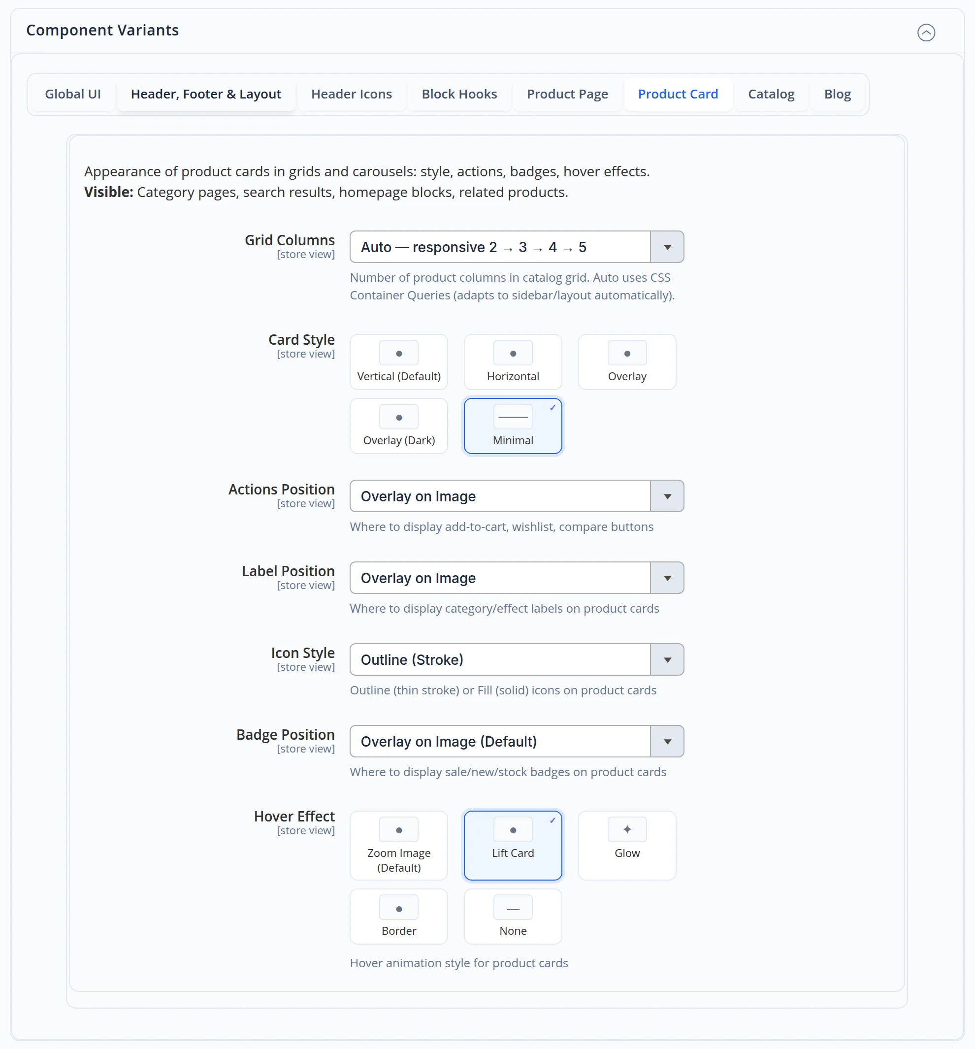
Product cards look the same in the catalogue, in search and on the home page
The number of columns adapts to the width on its own, from two to five. The card layout, where the buttons, labels and badges sit, the icon style and the hover effect are set once — and apply to every list of products on the site.
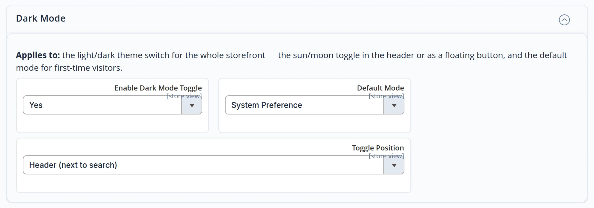
A light and a dark theme from the same brand colours
The switch sits in the header. By default the site follows the setting of the visitor’s device, and once the visitor picks a theme, the site remembers it on the next visit. The dark version is built from the same palette — there is no second set of colours to maintain.
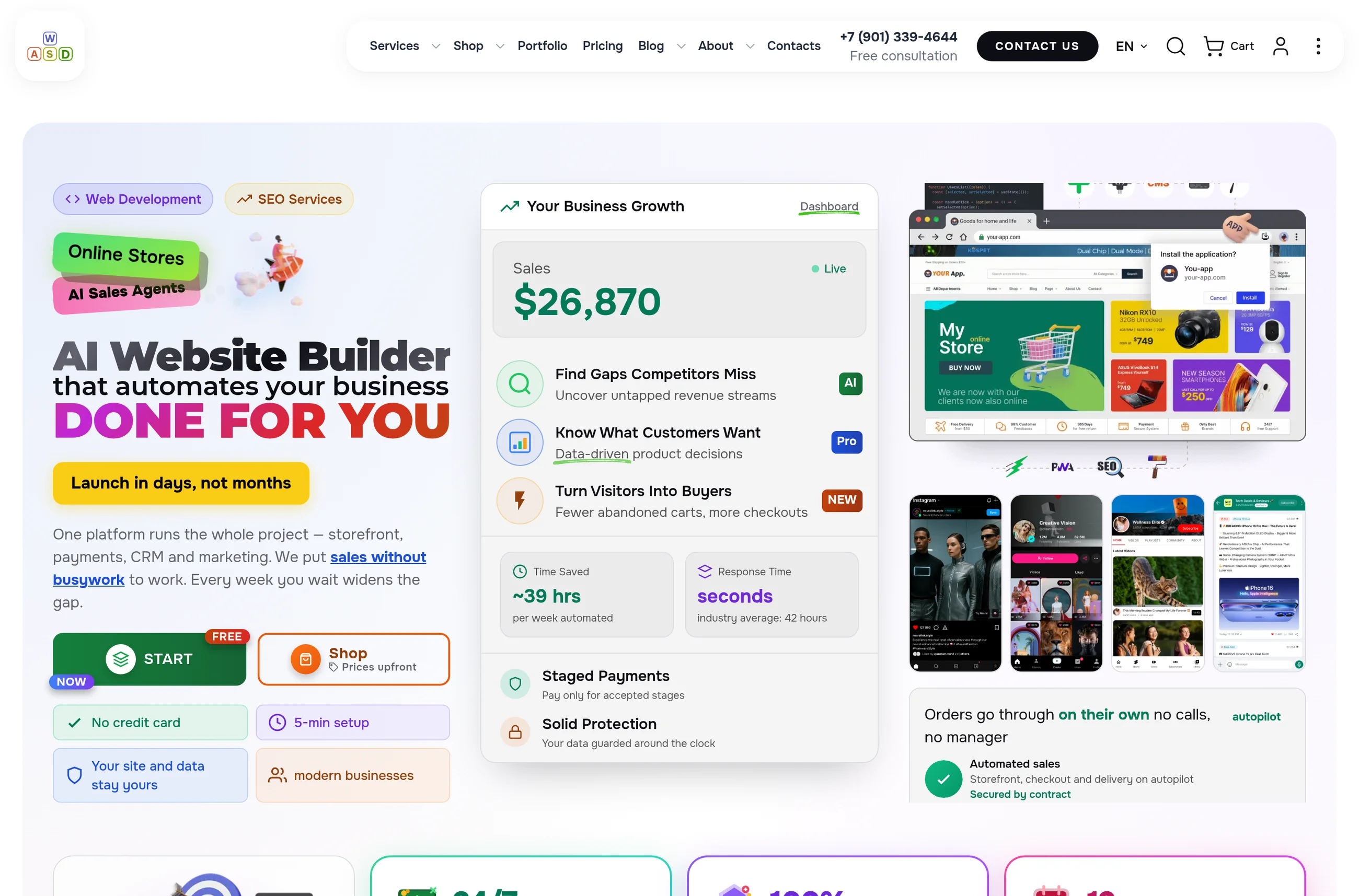
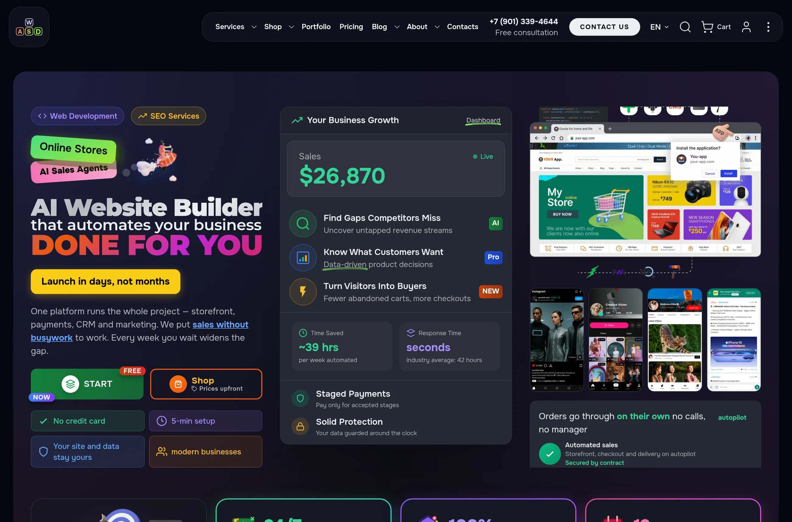
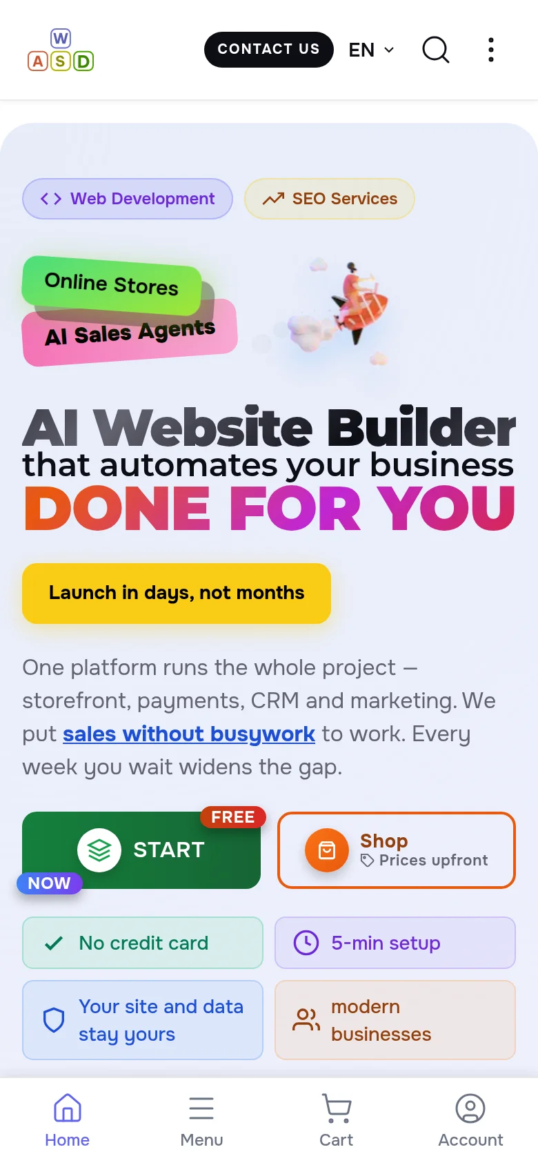
On a phone the site keeps its look and stays easy to read
Headings get smaller to fit the screen, and the main sections are one tap away in the bottom bar.
- No developer needed — after saving, the site rebuilds its look and refreshes the pages by itself; the change is visible on the next page load
- Each language version on its own — the English and the Russian version can have their own colours, fonts and styles
- Readability in sight — every colour pair is checked right in the form, before saving
- Fonts on your site — the seven fonts with Cyrillic are served by your own site, not by an outside service, and the text does not shift while they load
- The visitor chooses the theme — light or dark, remembered for the next visit
We went through the settings as an administrator and the site as a visitor
- We entered a new teal brand colour and pressed the palette button: every colour was filled in and all ten readability scores turned green. We did not save — the site kept its current look.
- We opened the home page of the English and the Russian version in the light and the dark theme, on a computer and on a phone: the same colours, the same layout, readable text everywhere.
- We checked what the browser receives: the fonts come from the site itself, and the main heading of this page is 36 px on a phone and 60 px on a large screen.
A site that looks like your brand — and stays that way
We will set up your site in your colours and fonts, with a light and a dark theme, and show your team how to change them later without us. Need the brand itself? See our brand identity service.
Another case: how visitors always know where they are on the site →