Store emails with your brand — readable in a dark mail app and on a phone
Standard shop emails often look like a system printout: a layout that is not yours, grey text that disappears when the mail app switches to a dark theme, a tiny table on a phone and a sender address nobody reads.
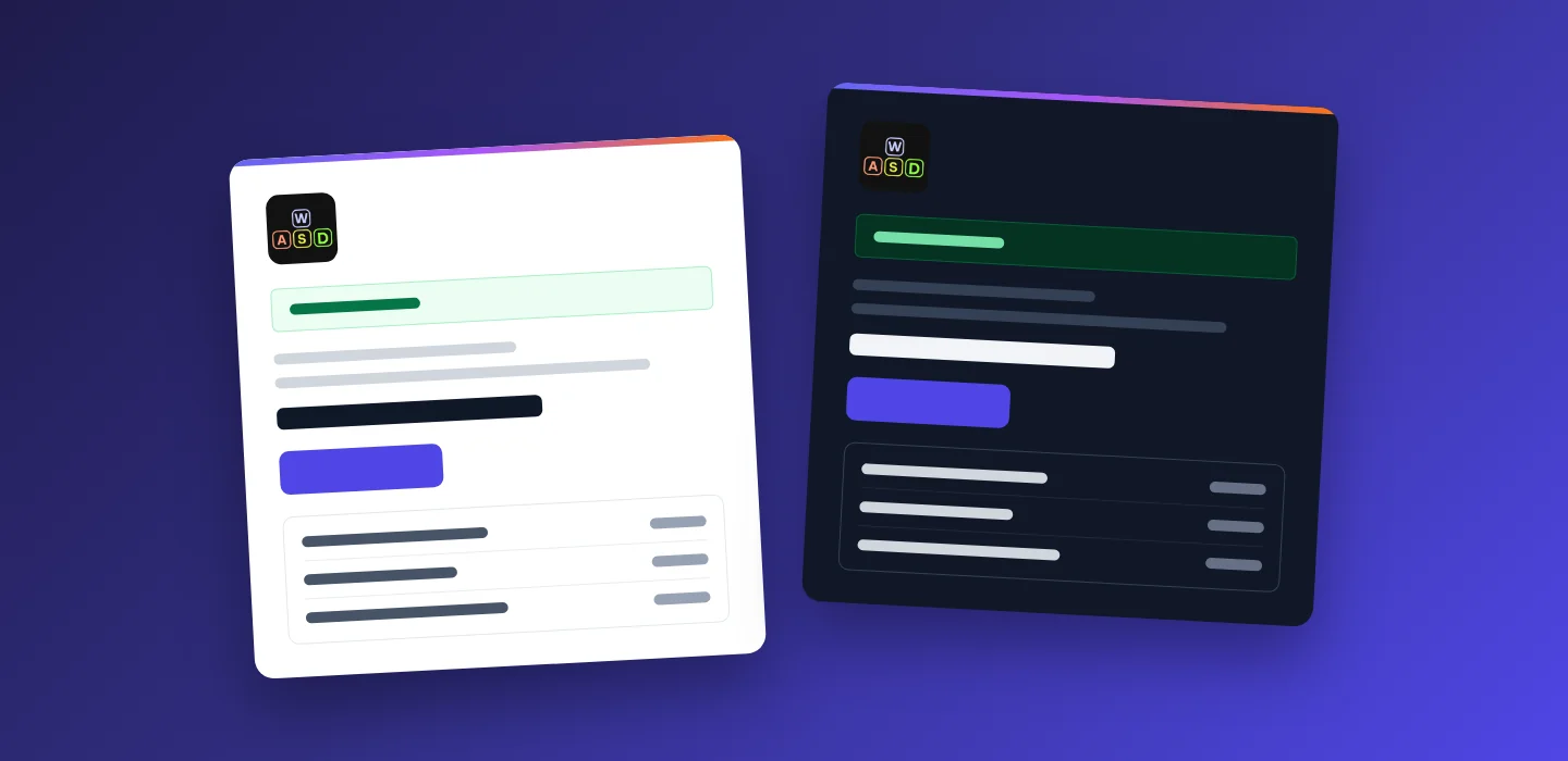
Here every letter the store sends — order, payment, account, password, subscription — shares one design with your logo, your contacts and your customer’s language. Mail apps that can show a letter in its own dark theme get a dark version prepared in advance, and on a phone the letter fills the screen with a button sized for a thumb.
For stores and service companies whose customers read their inbox
An order confirmation is the letter a customer opens most carefully. It either looks like your company — or like a system message.
Owner
Every letter carries your logo, your name and your contacts. Change the phone or the address once in the settings — every letter follows.
Customer
Sees what is inside before opening, reads the order comfortably at night in a dark mail app and on a phone, and finds one clear button.
Manager
Letters are sent from the store’s own address, and a reply lands in the store’s mailbox — the letters invite the customer to reply instead of saying “do not reply”.
Every letter looks like your company
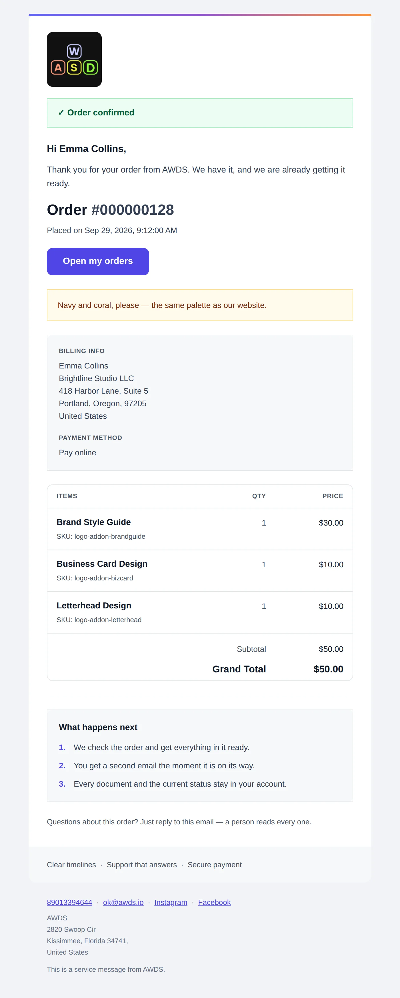
The logo, the store name and the phone, e-mail and address at the bottom come from the store settings. The order letter shows what was bought and at what price, the billing details, the customer’s comment in a highlighted box and a short “what happens next”, so the customer does not have to write and ask.
- Order, payment, shipment, refund — one header and one footer for every letter about an order
- Account, password, subscription — the same design for letters about the customer’s account
- The customer’s language — an order placed on the Russian version of the site gets letters in Russian, with prices in rubles and the date in Russian format
- Real prices — the letter shows the same amounts as the product page
The customer sees what is inside before opening
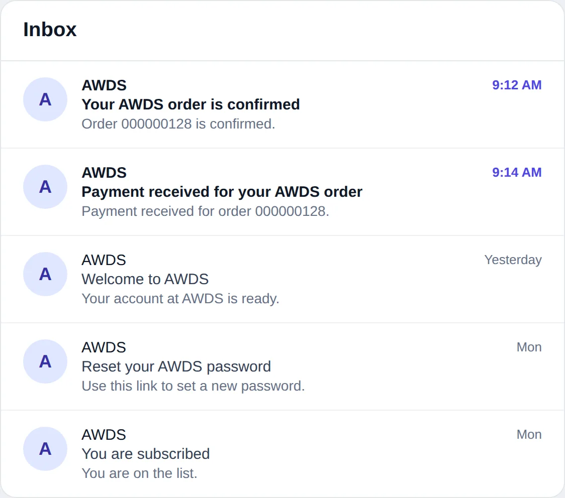
Every letter starts with a short hidden line that mail apps show next to the subject: the order number, “payment received”, “your account is ready”. Without it, the inbox shows the first words of the layout — often a menu or an address. The picture is an illustration built from the real subjects and preview lines of the store’s letters.
A dark version prepared in advance, not an accident
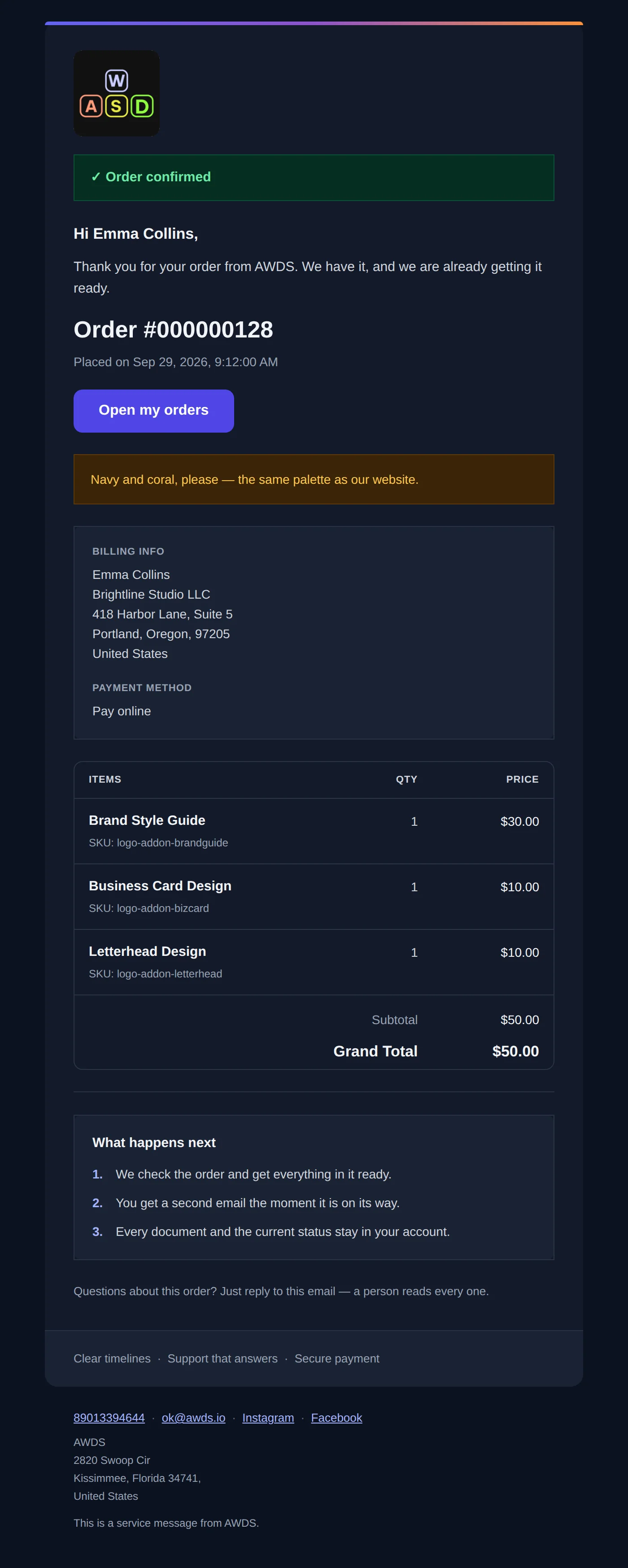
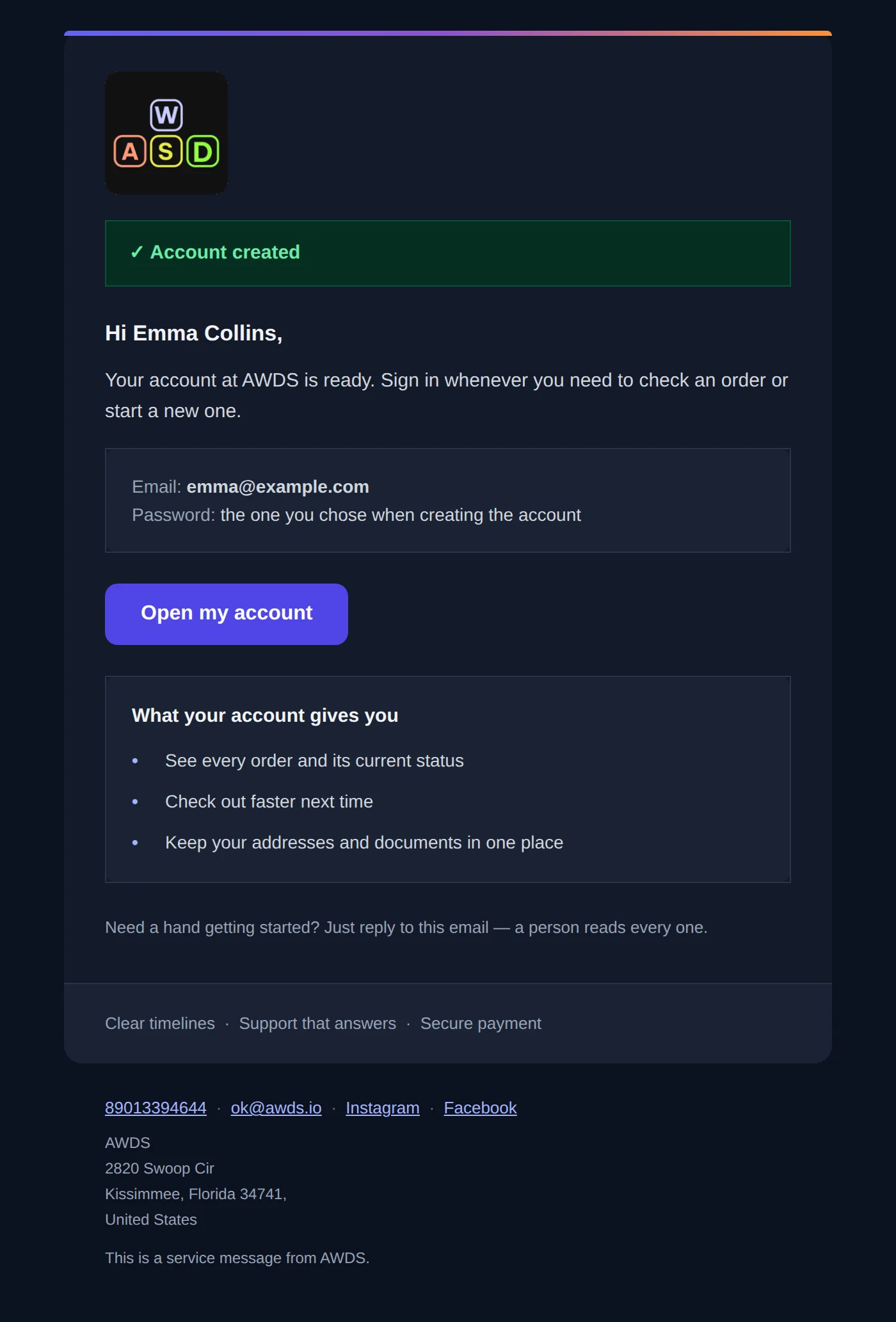
In mail apps that support a letter’s own dark theme, the letter switches to its own dark colours: every text, box and table has a colour chosen for a dark background, so nothing turns into grey on black. The logo has transparent corners and sits on the dark background without a white frame. Other mail apps show the light version or recolour it in their own way.
- Every text has its own colour — nothing is left to the mail app’s default colour
- Boxes and tables switch together with the text, so the contrast stays
- The logo with transparent corners — no white square on a dark screen
- Checked by a program — every text against its background, in the light and in the dark theme
A letter that fits the phone screen
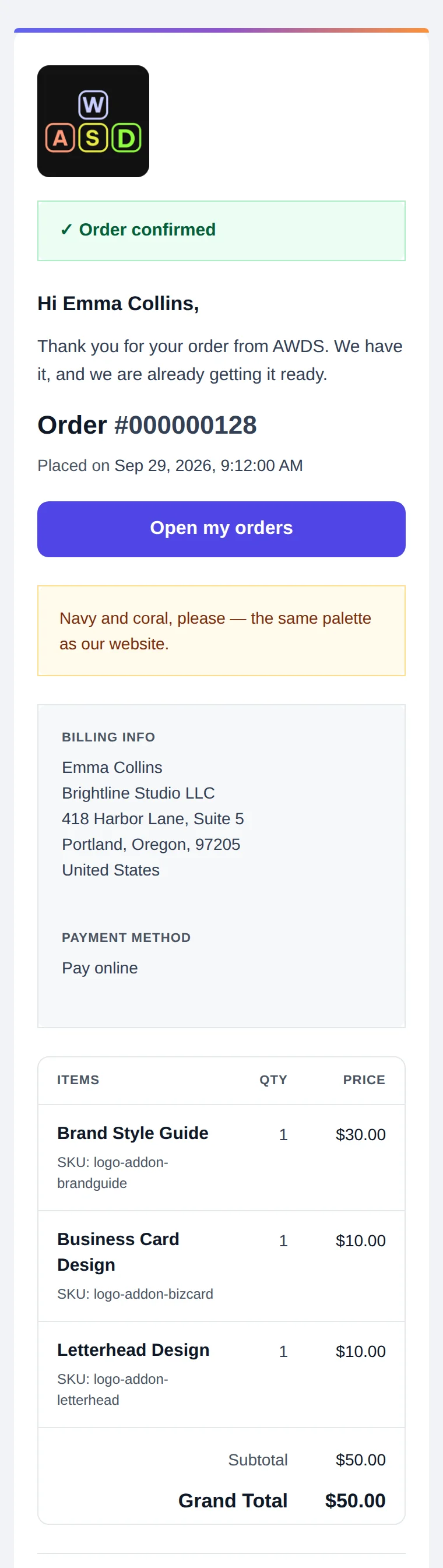
Most customers open letters on a phone. On a narrow screen the letter takes the full width, the main button stretches across the screen so it is easy to hit with a thumb, and long service names and codes wrap inside the table instead of pushing it off the screen.
- Full width — no tiny letter in the middle of the screen
- A button for a thumb — across the whole width
- A table that fits — names and codes wrap, the total stays in view
Letters that answer the next question
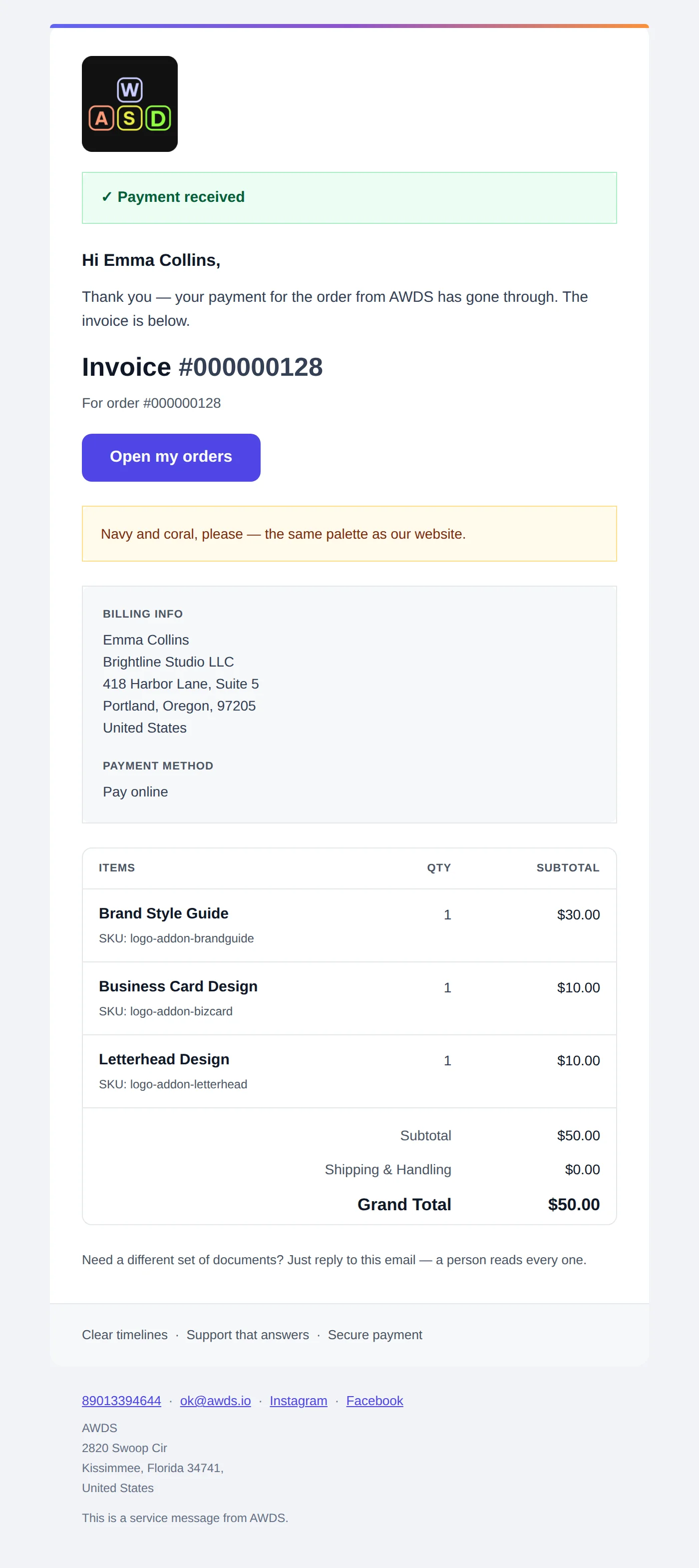
The payment letter repeats the paid items and the total, so the customer has everything in one place. The password letter has a button and a backup link for when the button does not work, and it says what to do if the customer did not ask for a new password.
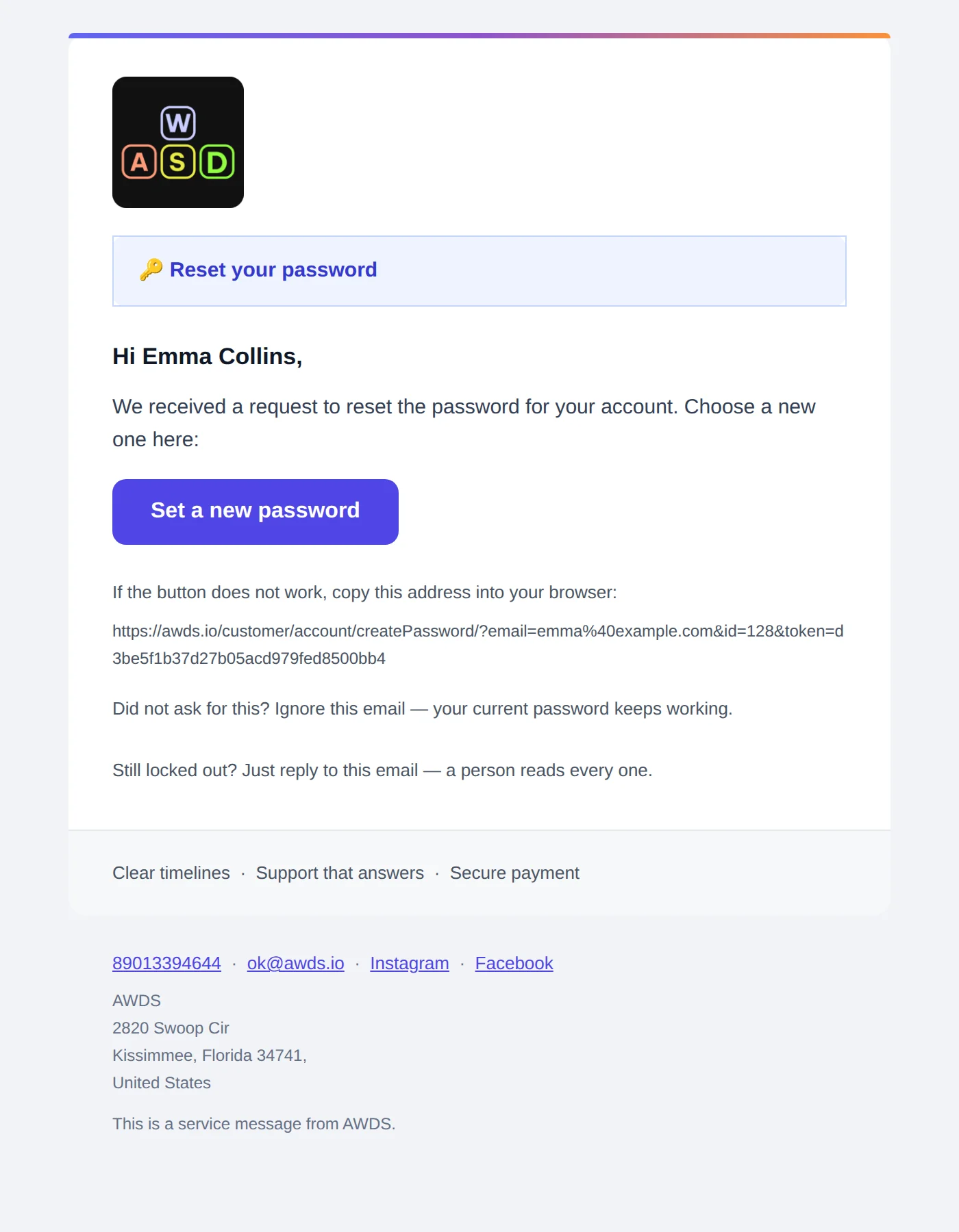
We rendered the store’s letters and checked every one
- We built the letters from the store’s own templates with a test order and test customers — nothing was sent to anyone. The prices in the pictures are the prices on the site.
- A program checked 52 templates of the store in the light and the dark theme, on a wide screen and on a phone-sized one, for both language versions: every text against its background — 0 problems.
- Along the way we found that the logo had white corners on a dark background and replaced it with a version with transparent corners. Earlier the same check found that the options of an ordered service merged with the dark background — that was fixed before this case.
Letters your customers actually read
We will build your store with a full set of letters in your design and your customers’ languages — and check every one of them in the light and the dark theme and on a phone.